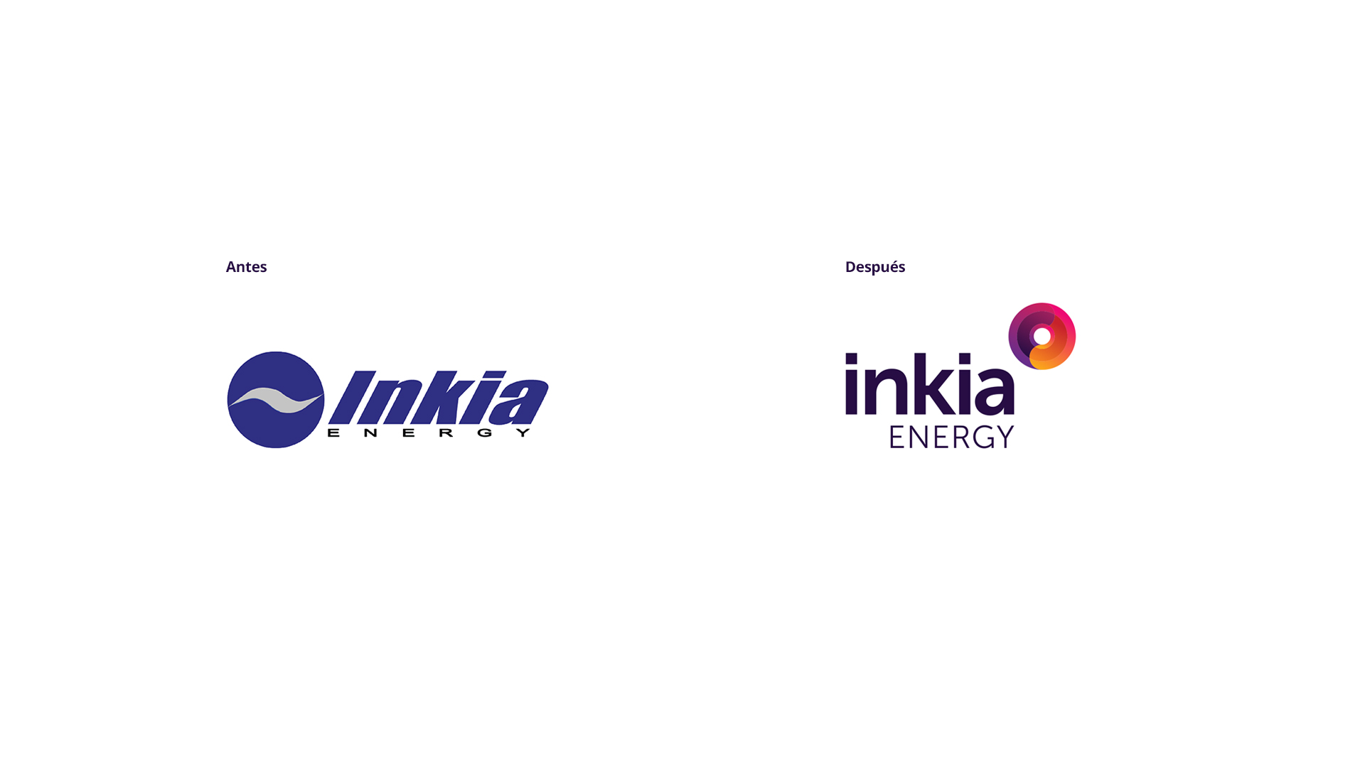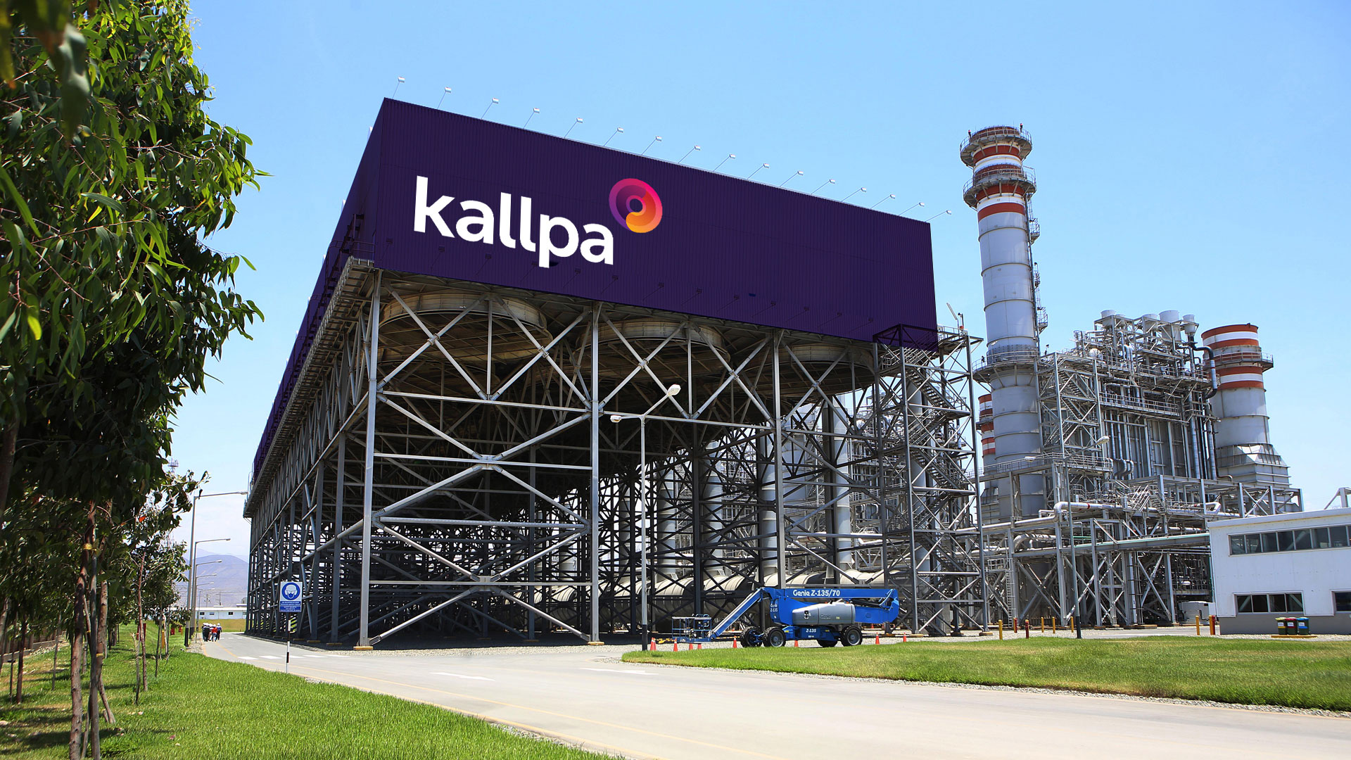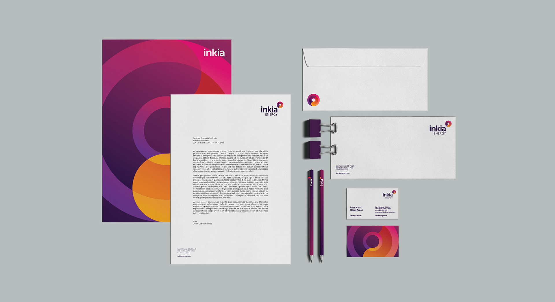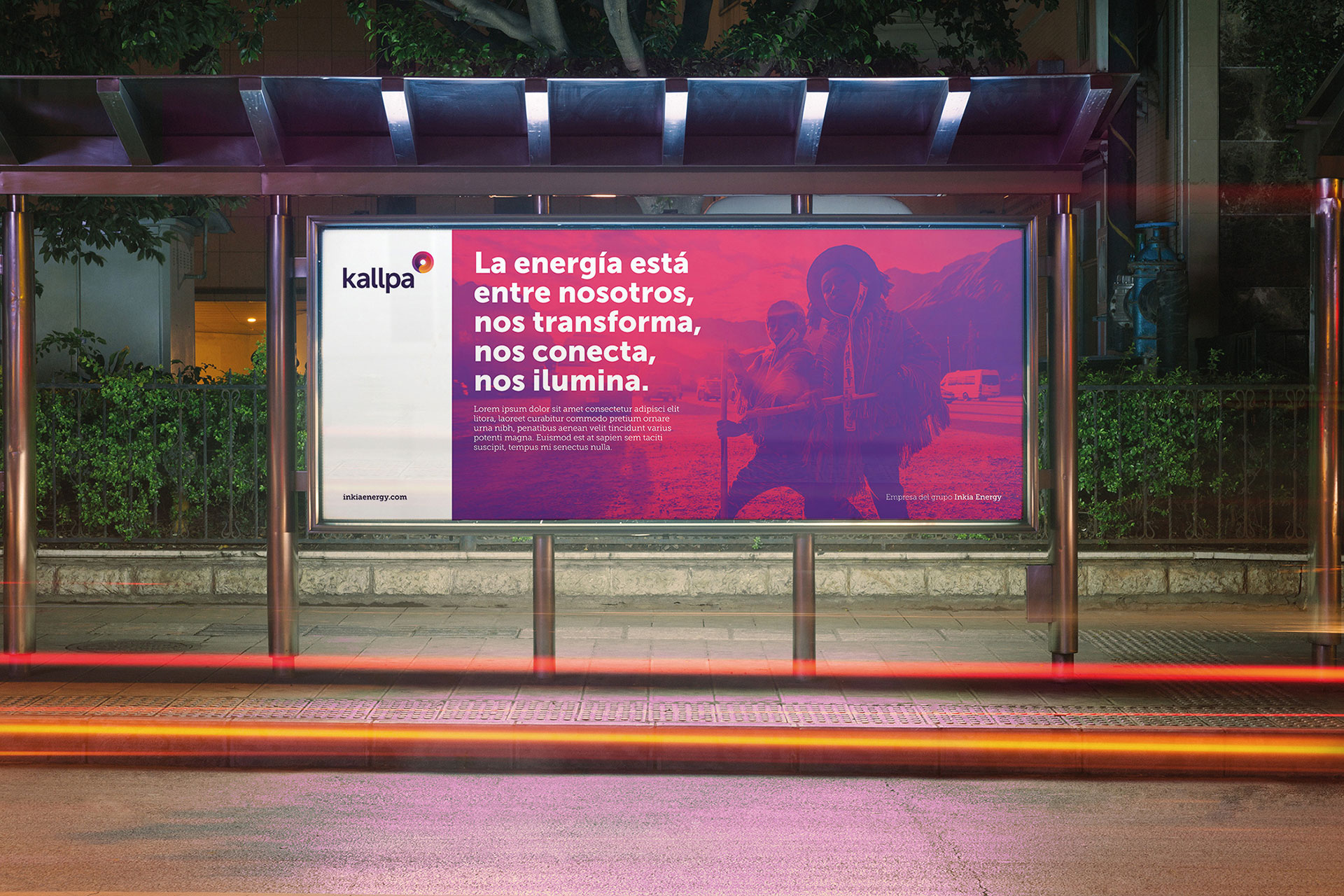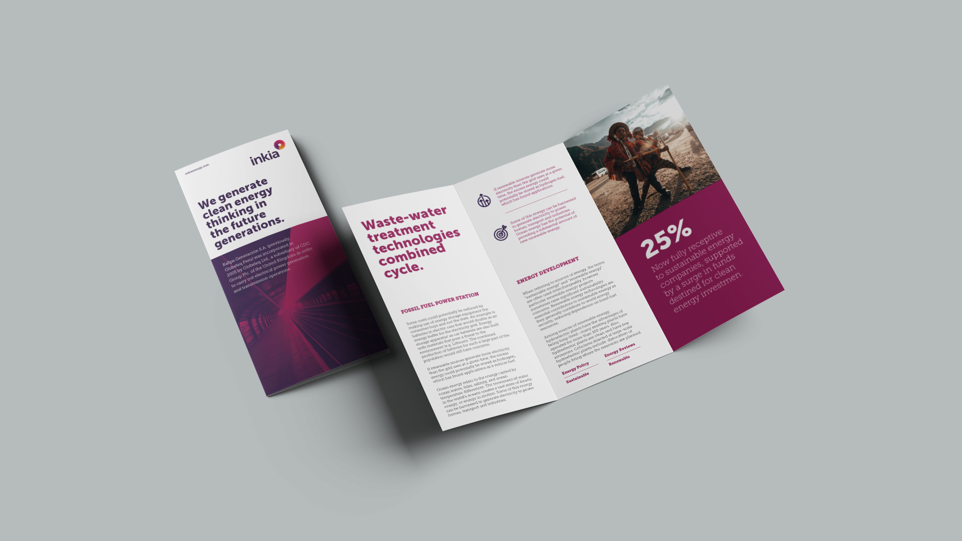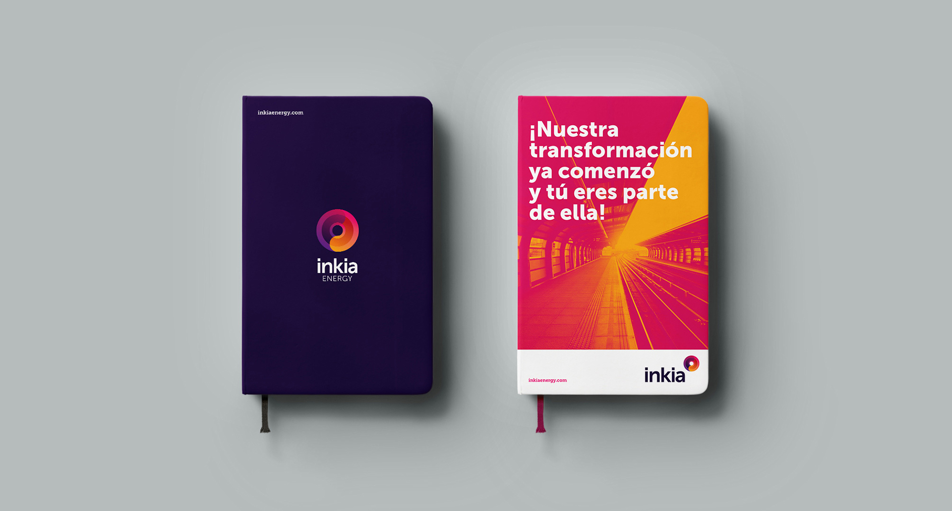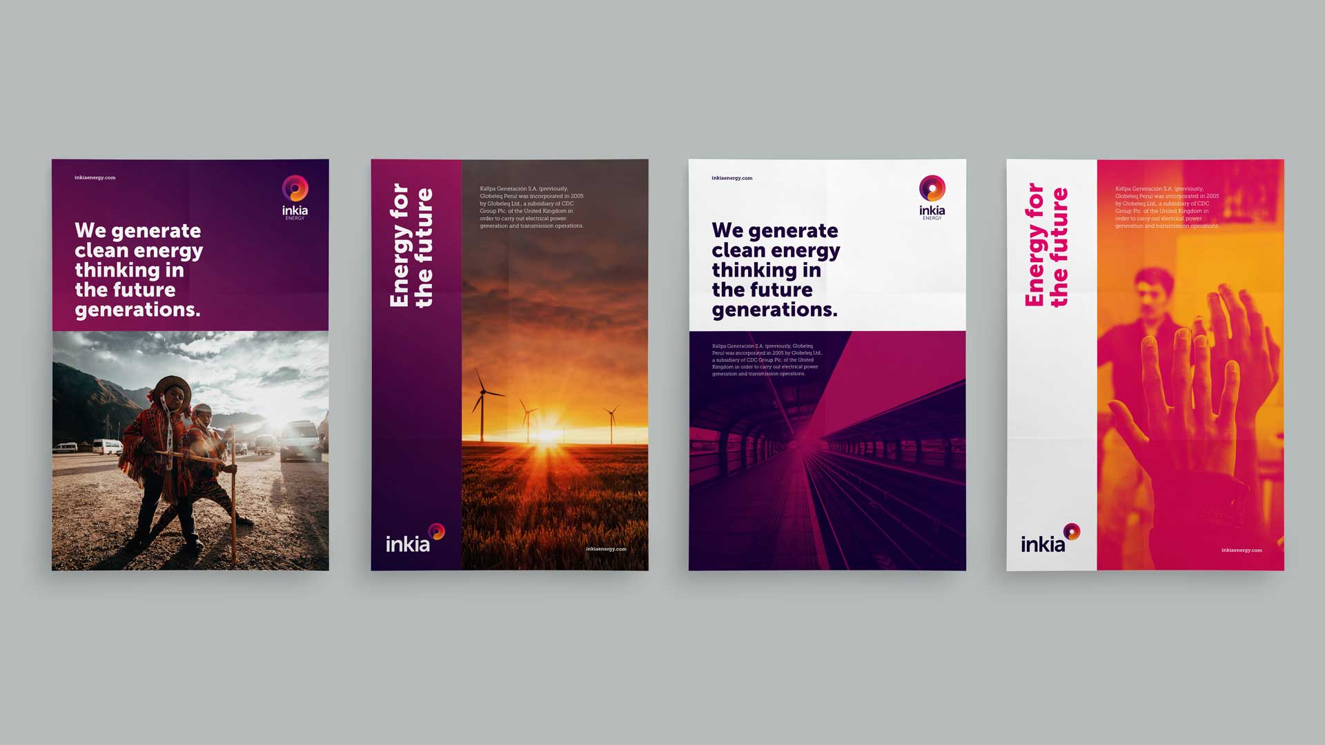
Inkia Energy is an energy holding company with an important track record and presence in different areas of Latin America, which is why it handles various brands and names in each country. We help them unify under a single powerful brand to reinforce their identity.
La energía no se crea ni se destruye, solo se transforma. Energy is not created or destroyed; it is only transformed. Standardizing the identity of an energy holding company with different units was a challenge, but it was a necessary step to bring order and structure to it.
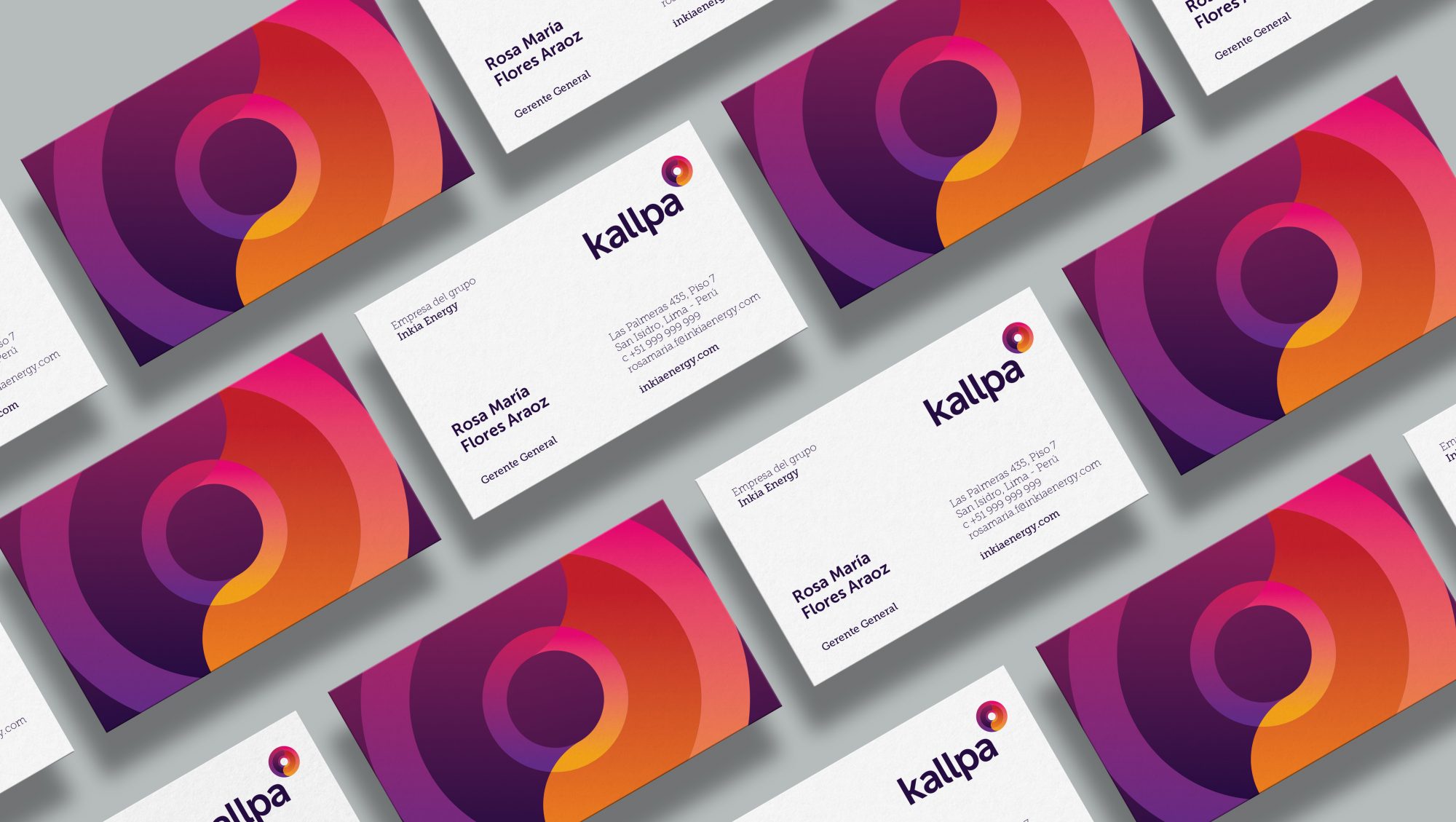
Once the concept was chosen, a logo had to be created that unified the values of the brand. To do it, we took as a starting point the renewable and sustainable energies with which Inkia Energy works.
We used a range of colors that refers us to the sun as the most essential source of energy on the planet. This, applied with a ying and yang effect, produced a dynamic symbol that reminds us that energy is always changing, and the world never stands still.