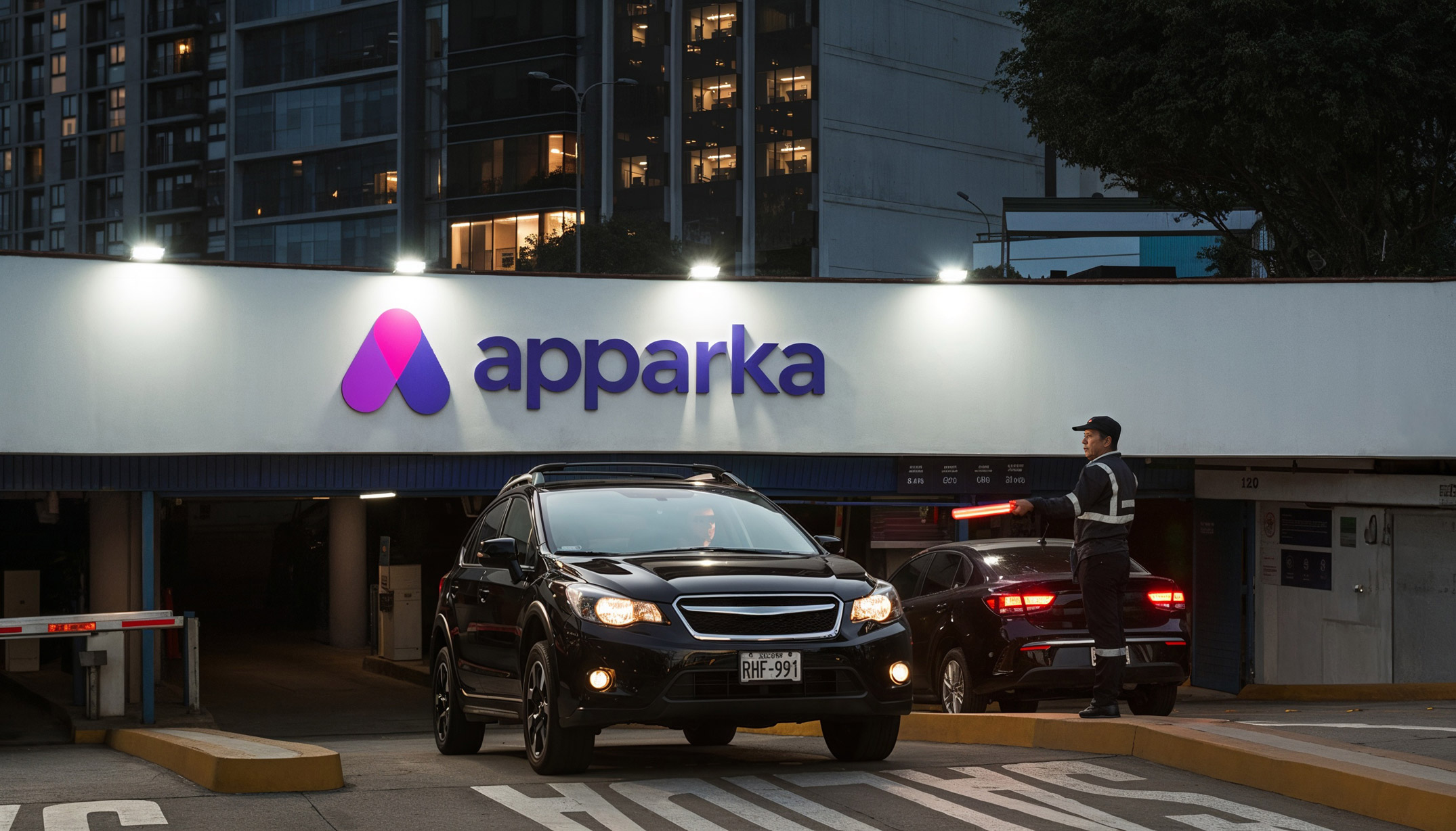
Apparka, formerly Los Portales Estacionamientos, is today the largest company in the parking sector in Peru, managing around 60% of formal parking lots. When they had to go through the rebranding process, they stood by our side to get through it.


Due to a change in its shareholding, the largest parking company in Peru had to change its brand name. In that sense, the first challenge that came to us was the renaming, since we had to leave the name of Los Portales Estacionamientos. The decision was to adopt one that already existed in its ecosystem, that of its digital application: apparka. In addition to ensuring a simple association, the name, more global and modern, was in line with the brand’s modernization and innovation objectives. As part of this process, we also worked on the definition of the brand promise, focused on the solutions that apparka provides not only to its users but to the entire community: “We promote viable cities”.


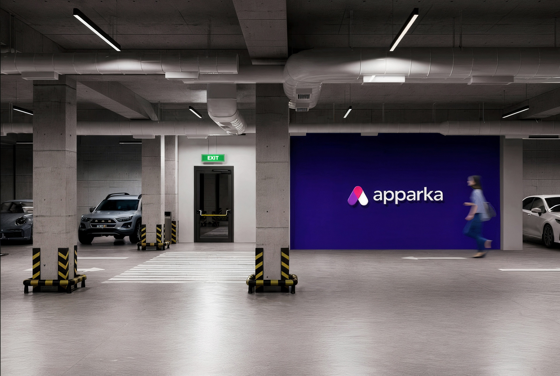
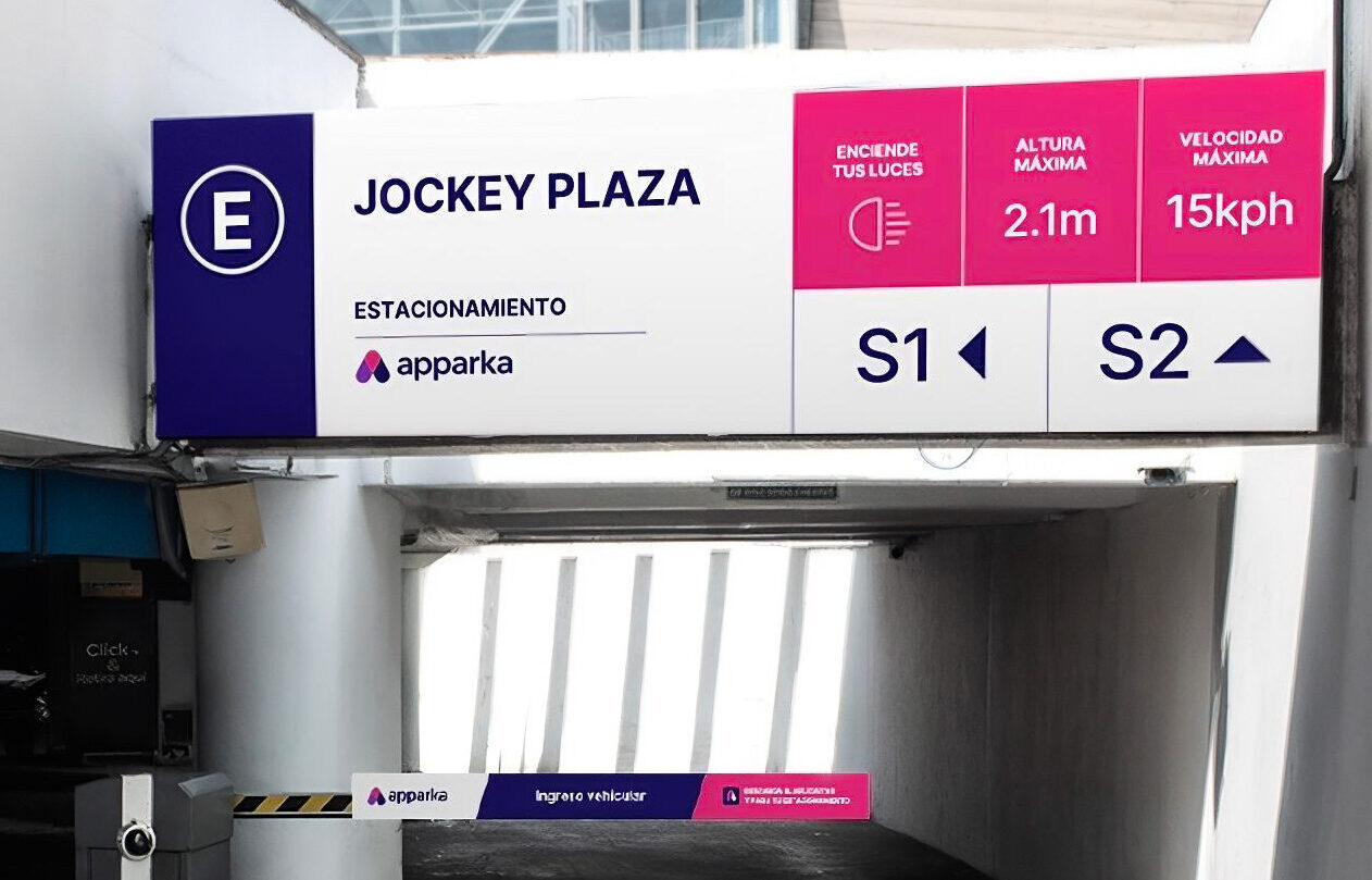
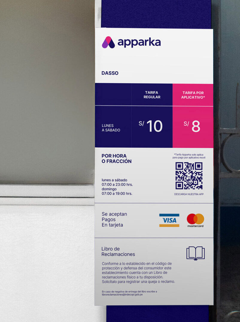
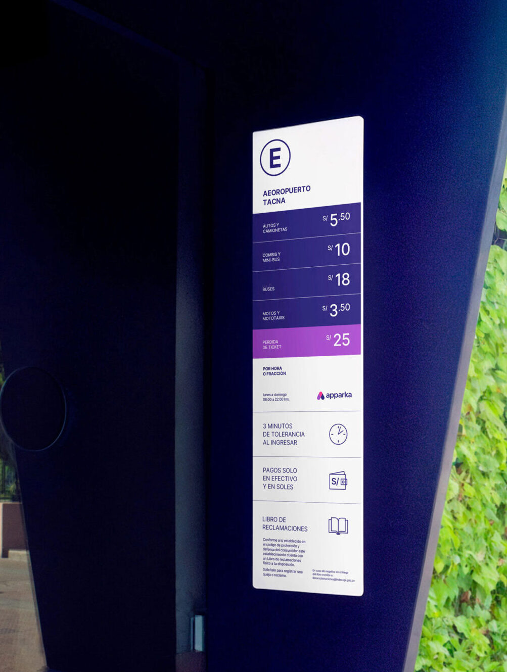
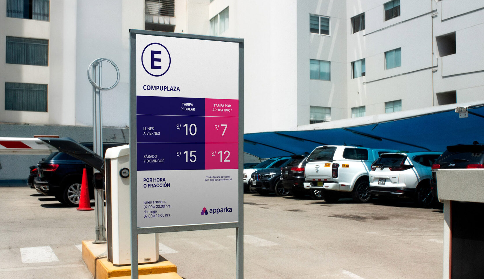
In the visual identity work, an isotype was created based on the icon of the location pin, to convey the idea of the brand’s parking coverage. Its shape and colors facilitate its use within a visual system in which it can be transformed into various figures and icons.
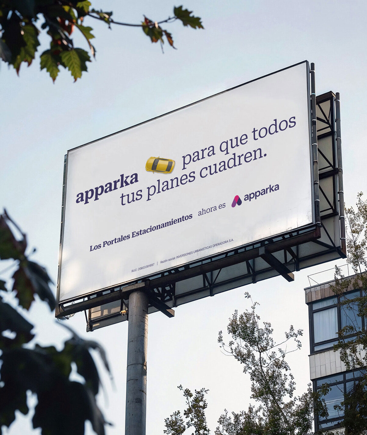
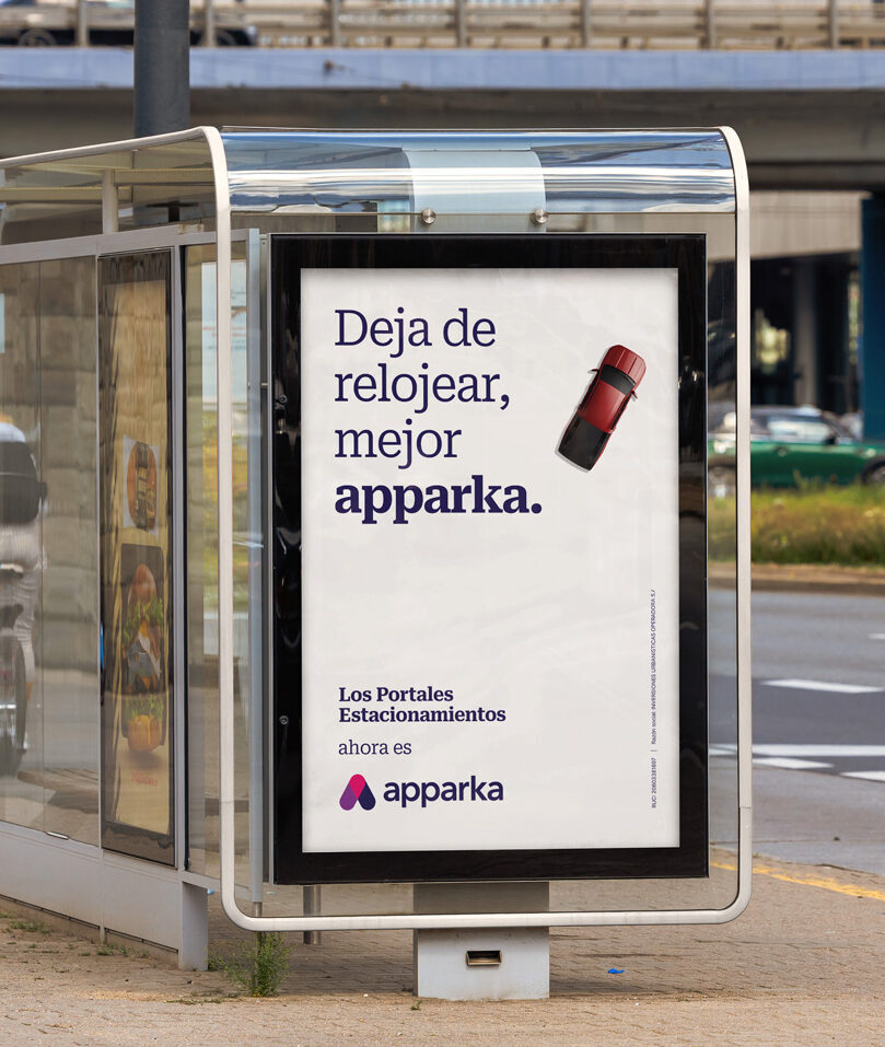
Our work also included the development of a launch campaign in which the objective was, above all, to communicate the rebranding. Taking the user and his daily life as a central axis, messages such as “stop watching, better apparka” or “apparka so that all your plans work out” were created, with cars interacting with the text. All these sentences closed with the claim that reinforced the main idea: “Where once people parked, today they apparka”.