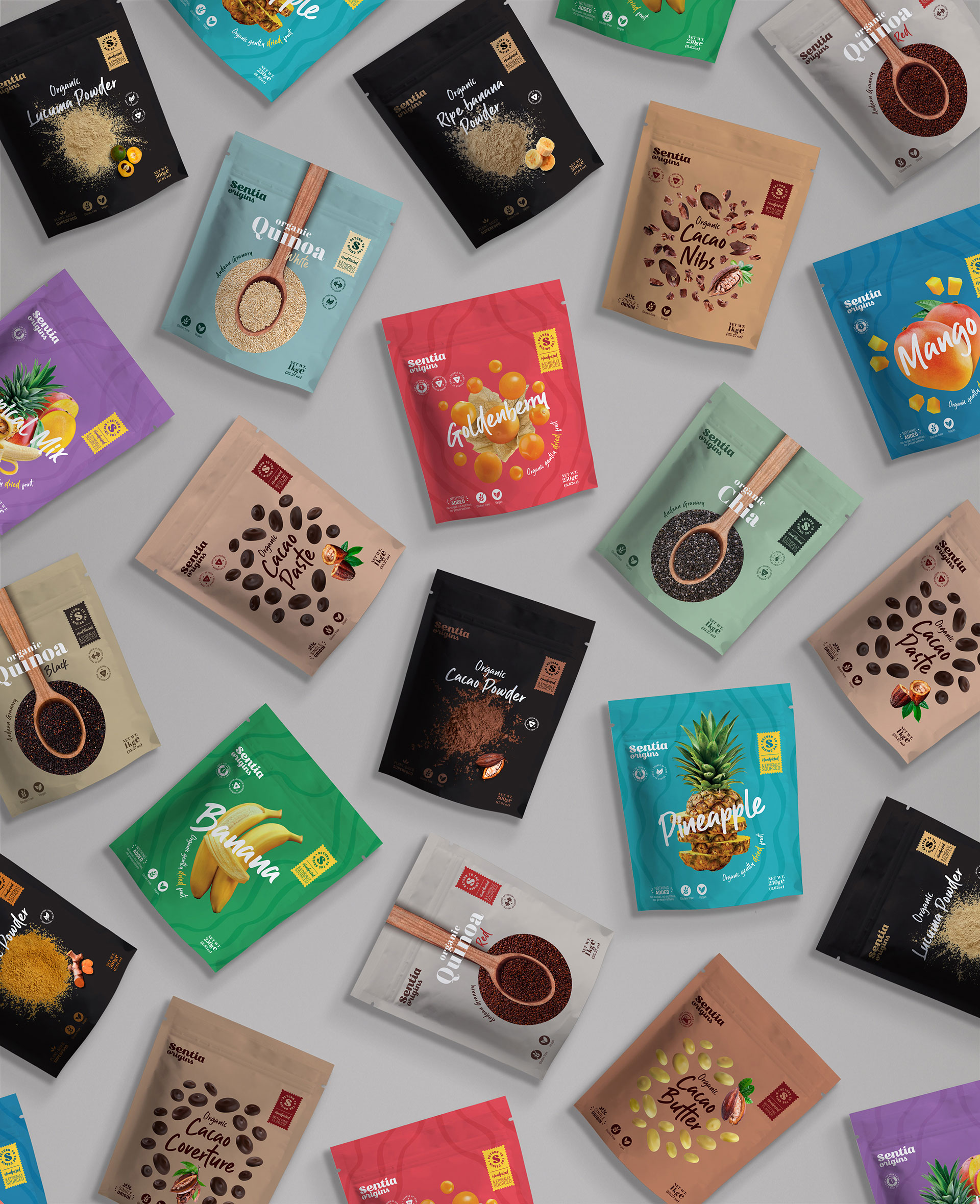
Sentia Origins is a super food brand that committed to its origins to cross borders. We took on this challenge as our own and worked on a graphic identity that would bring its products closer to a new consumer.
When Sentia Origins remembers its provenance, it keeps in mind not only its DNA and where its supplies come from, but also those responsible for producing them. The challenge we faced was to design a visual language that felt global and modern without neglecting the link with its Andean and millennial origin.
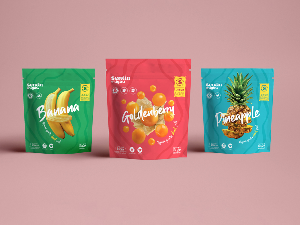
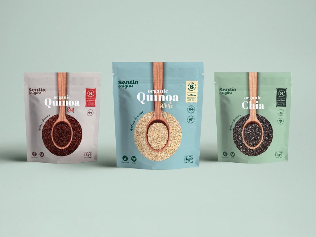
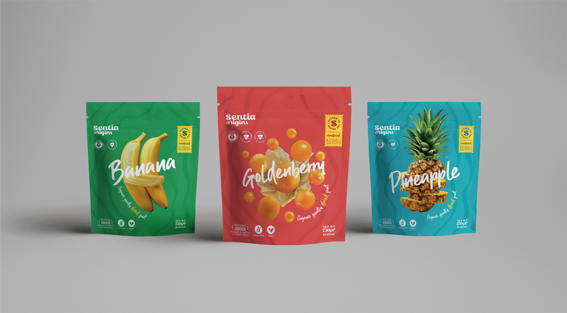
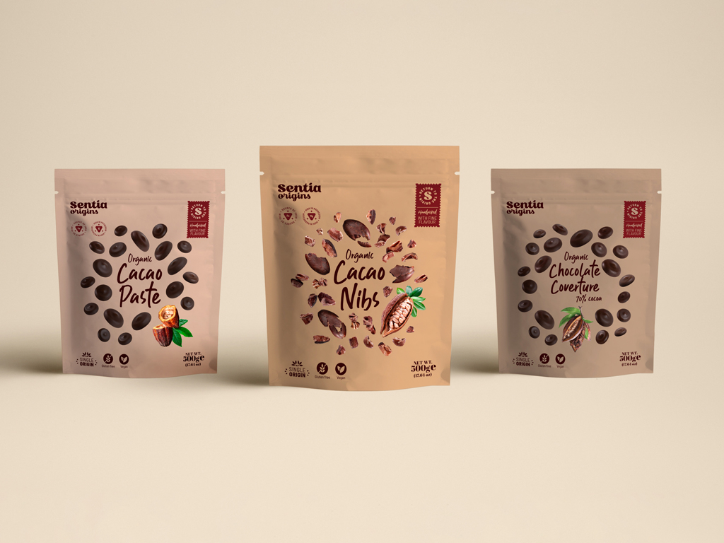
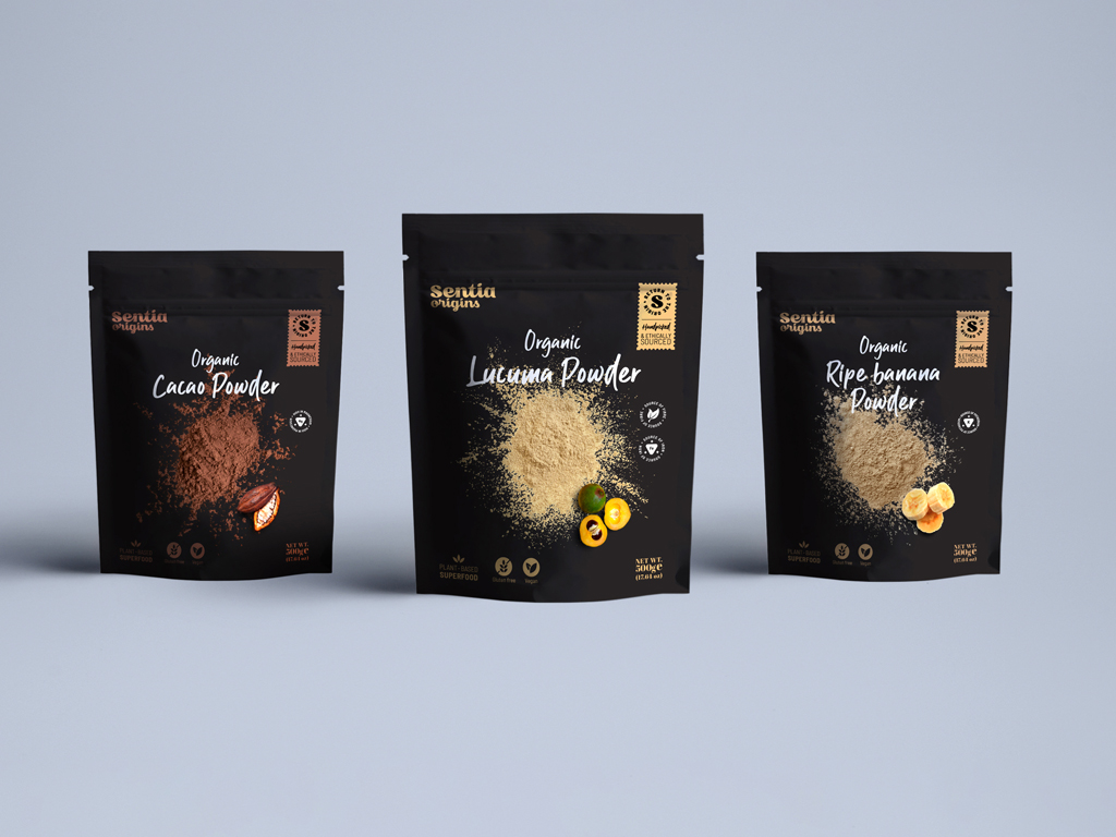
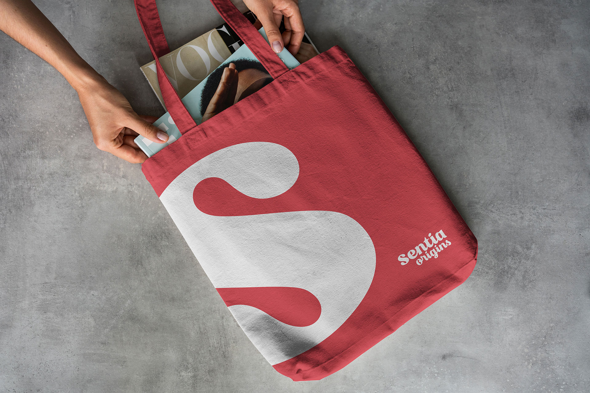
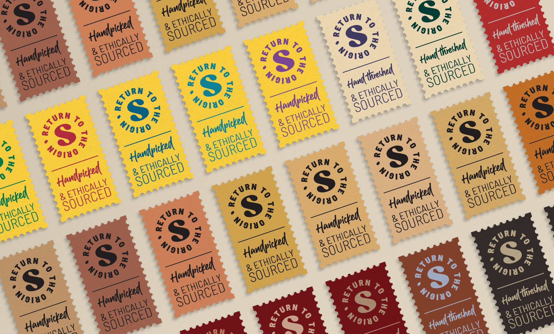
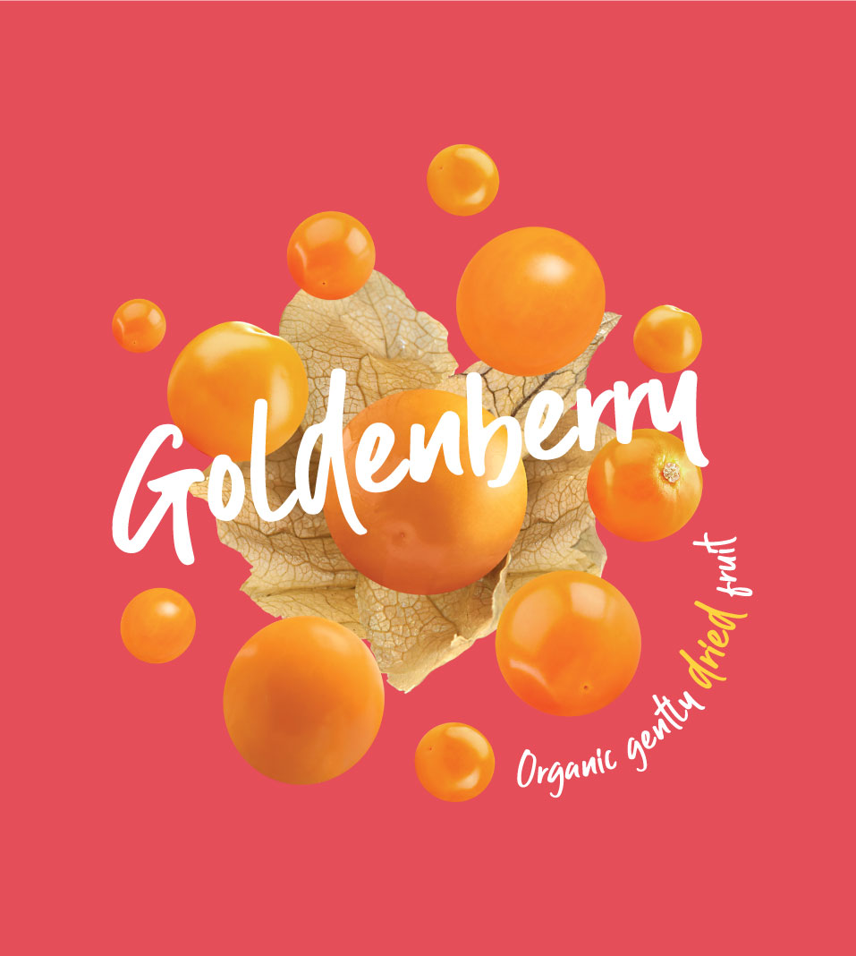
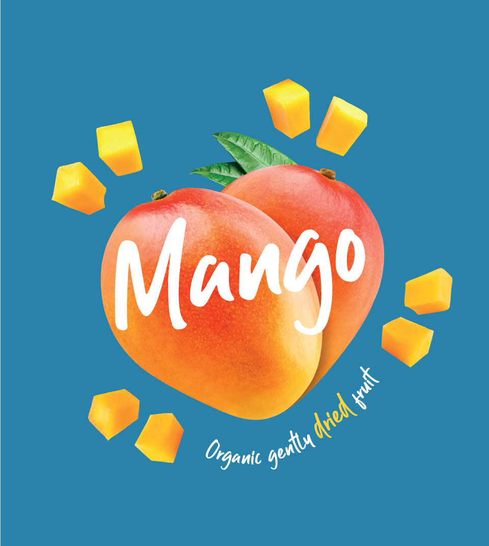
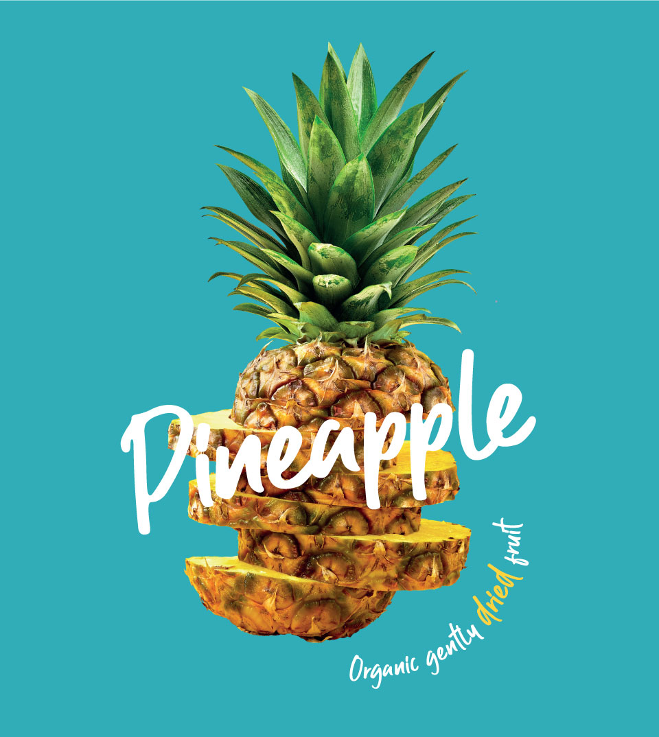
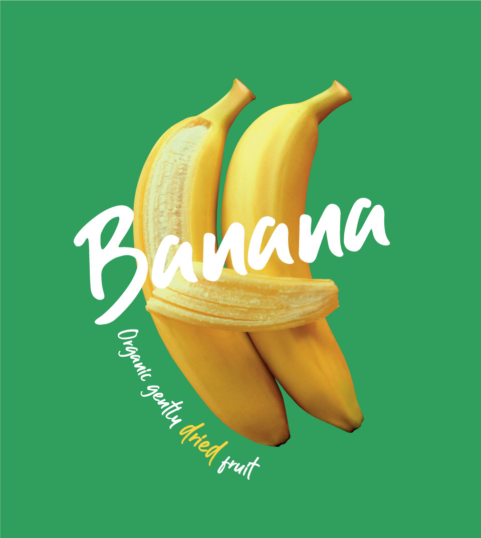
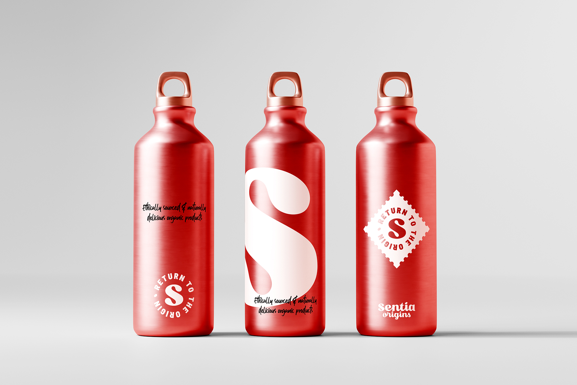
To give it dynamism and freshness, we used bright colors and proposed the use of fruit photographs that would give it a touch of irreverence. In the logo, the letters are connected, conveying the idea of fluidity and linkage In the logo, the letters are connected, conveying the idea of fluidity and linkage. This is reinforced with the use of a postage stamp, which appeals to the concepts of origin and traceability.
Thus, Sentia Origins is a brand that brings its products and its producers closer to the international market, and uses its origin as a bridge.