Few brands can boast of having accompanied Peruvians for a hundred years. Bazo Velarde is one of them. And after reaching this milestone, it aimed to consolidate its B2B channel and accelerate the takeoff of B2C. To achieve this, we developed an identity system capable of organizing its portfolio, strengthening its recognition and preparing the brand for a new stage.
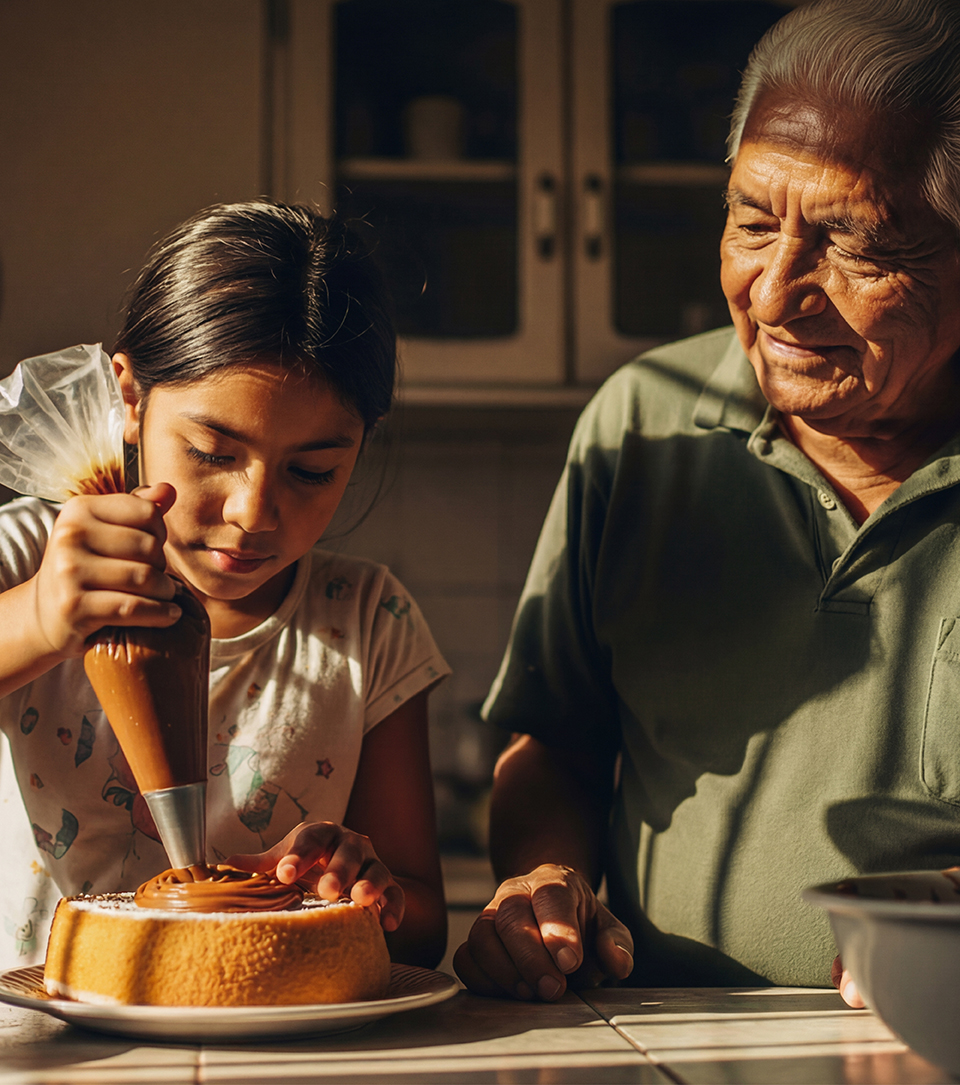
Bazo Velarde is a brand deeply rooted in the Peruvian imaginary, associated with tradition, countryside and quality. But over time, its family of products grew, generating a visual diversity that detracted from its solidity and recognition. The challenge was to evolve by translating its history into a more current, legible and flexible language.
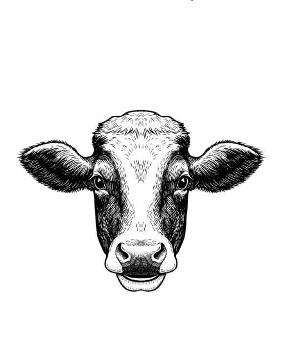
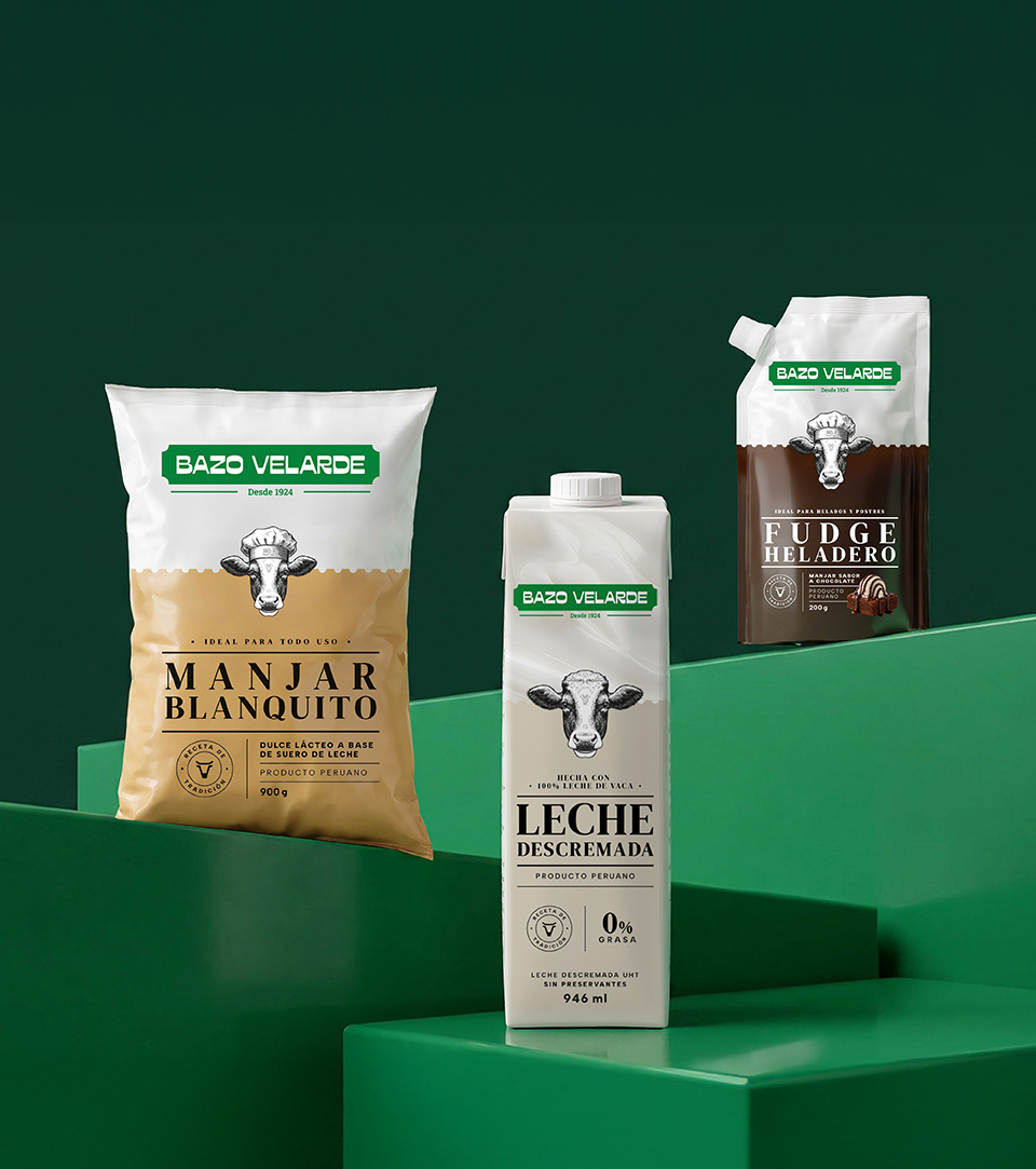
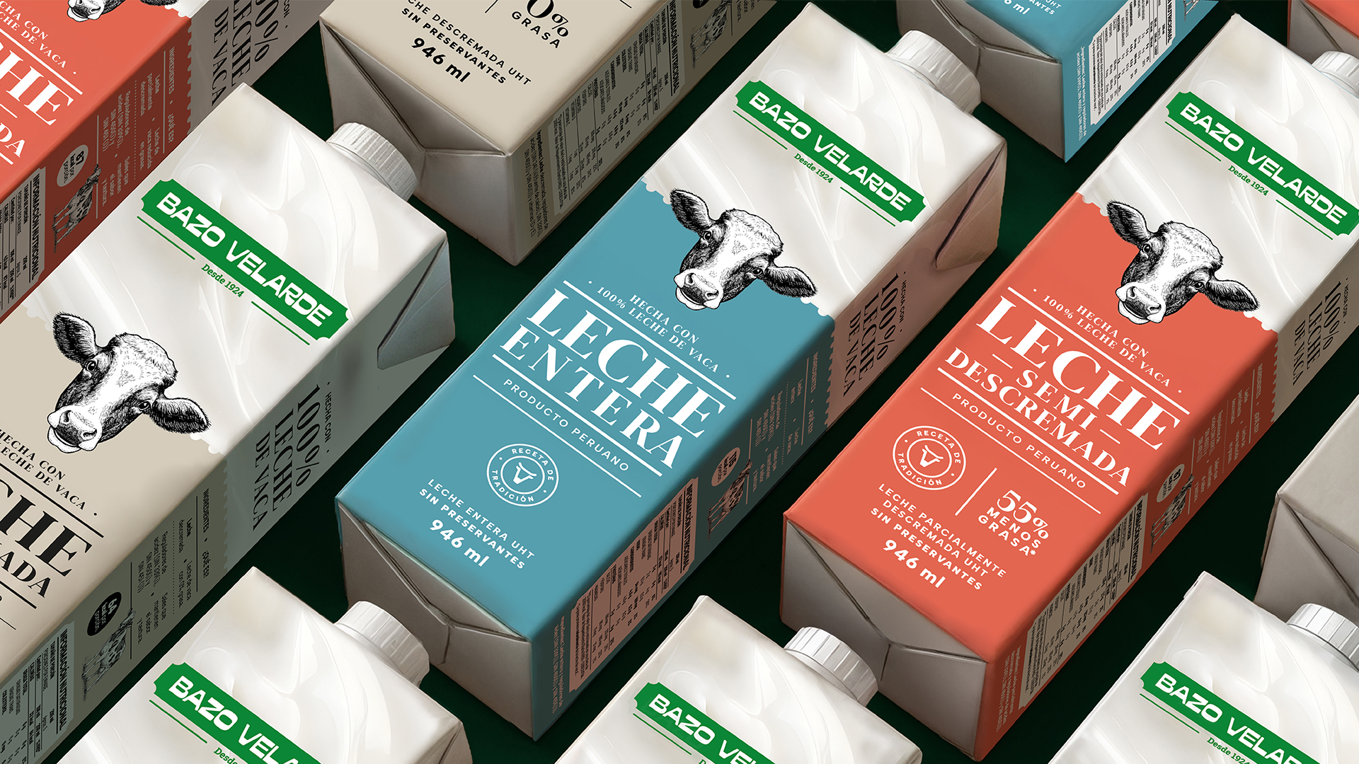
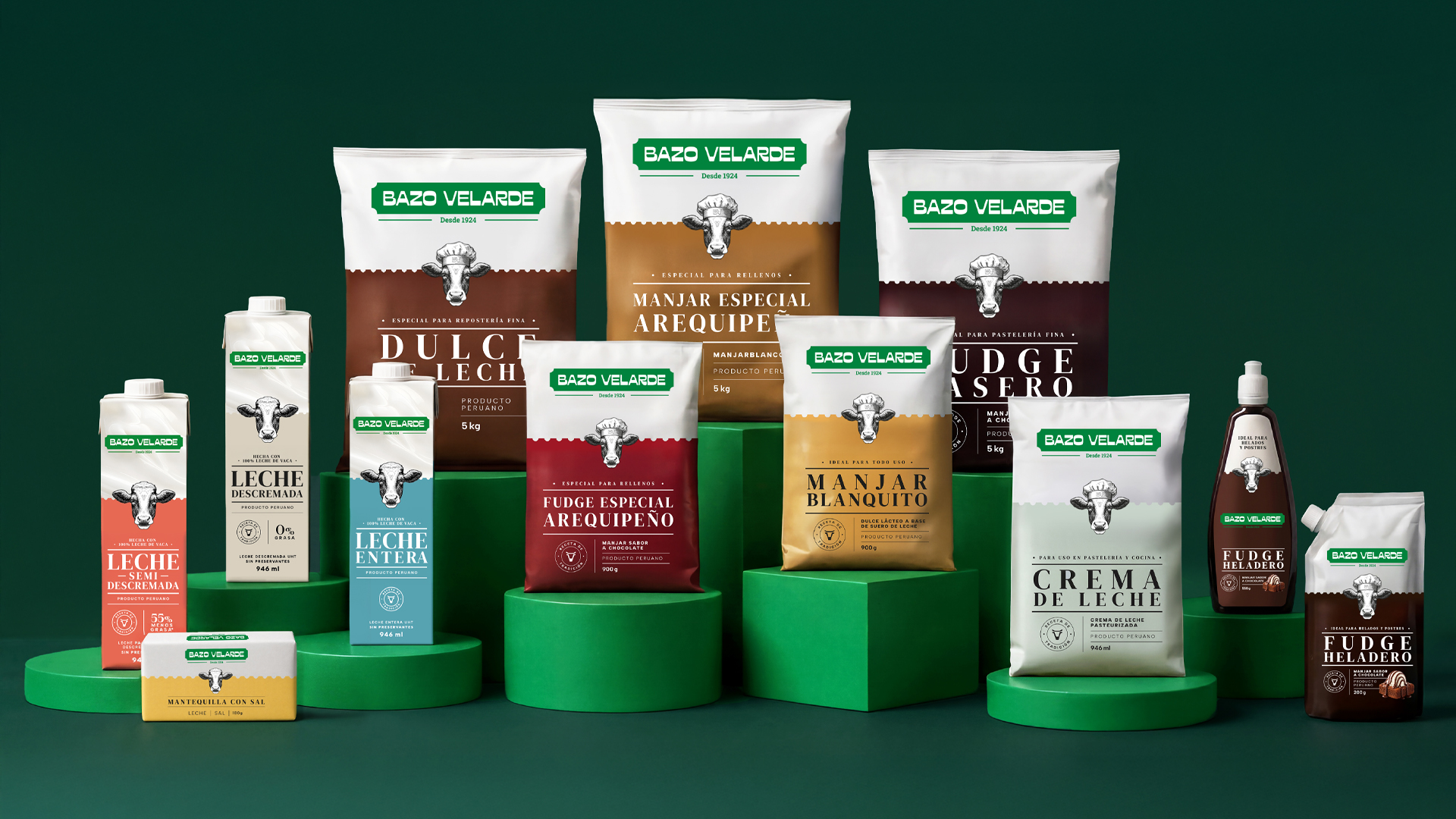
We updated the logotype, maintaining its support inspired by hacienda signs, but refining its typography to improve its presence and legibility. We also kept the protagonist of its packaging (the cow with a chef’s hat) as a symbol of continuity, but transformed it and unified its different versions into a consistent and contemporary representation.
In addition, to organize the portfolio, we built a chromatic language that differentiates each category, which also facilitated the development and launch of new products, such as its line of milks and butter.
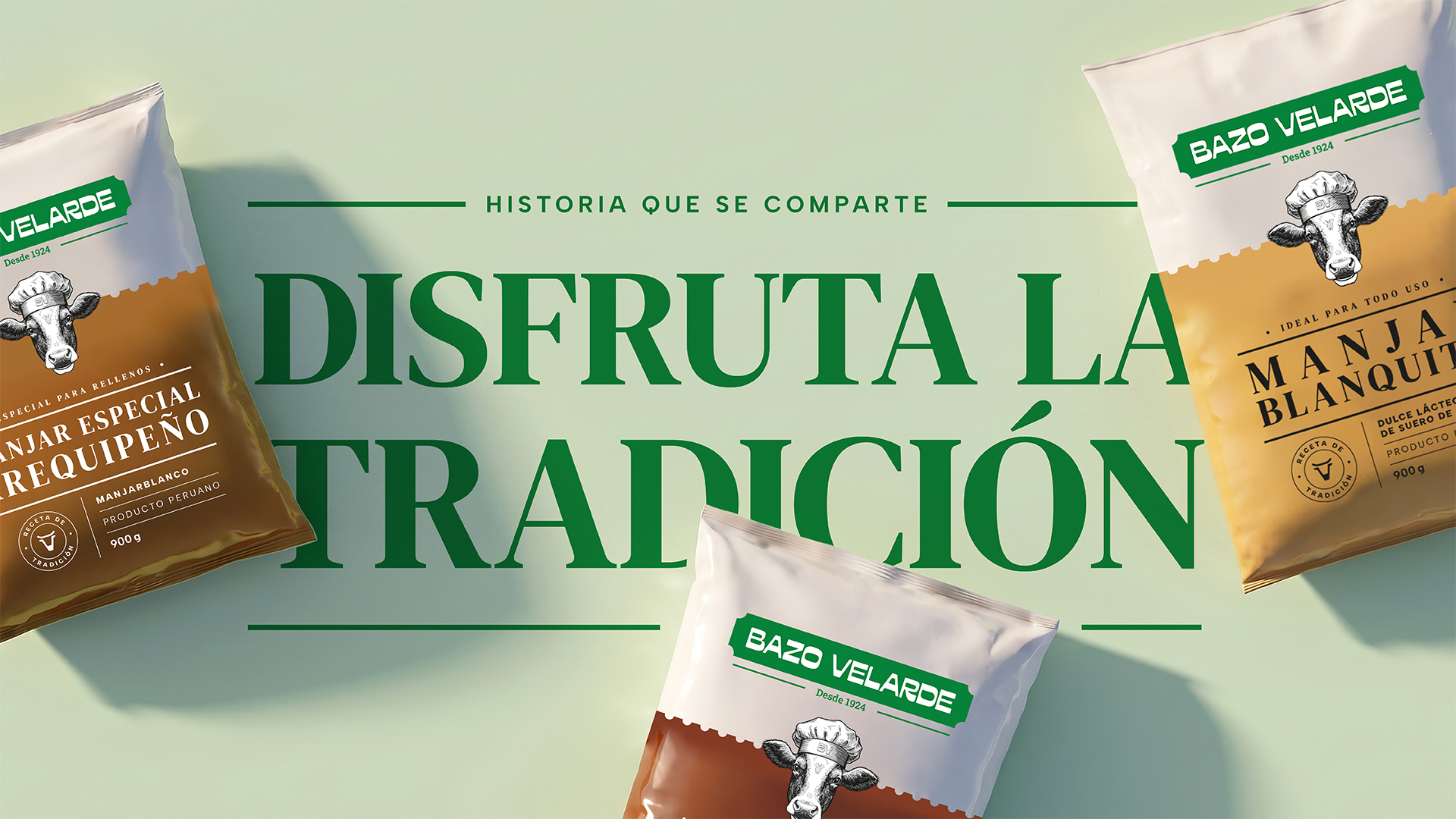
Today, Bazo Velarde presents itself with a more coherent and versatile identity. A brand that honors its one hundred years of history, but looks forward with projection, ready to grow both in the professional channel and in everyday consumption.