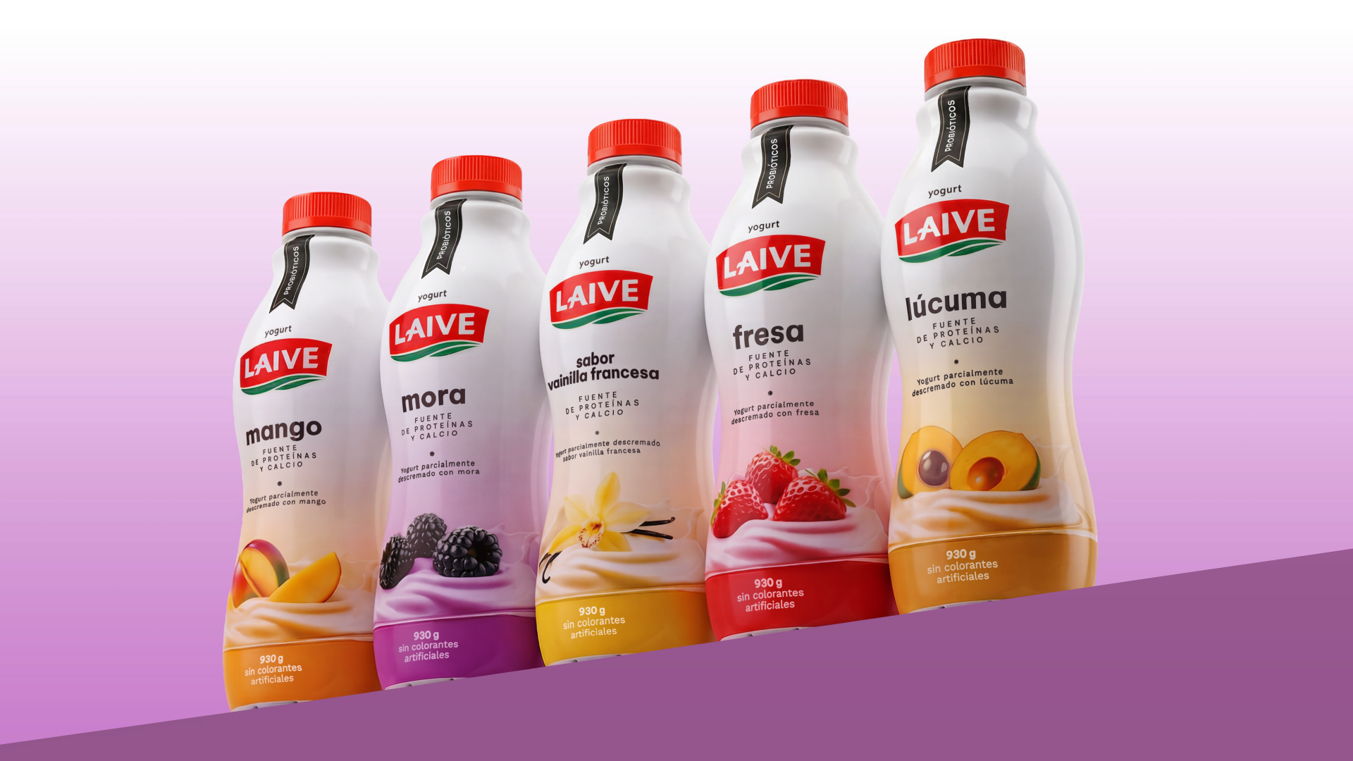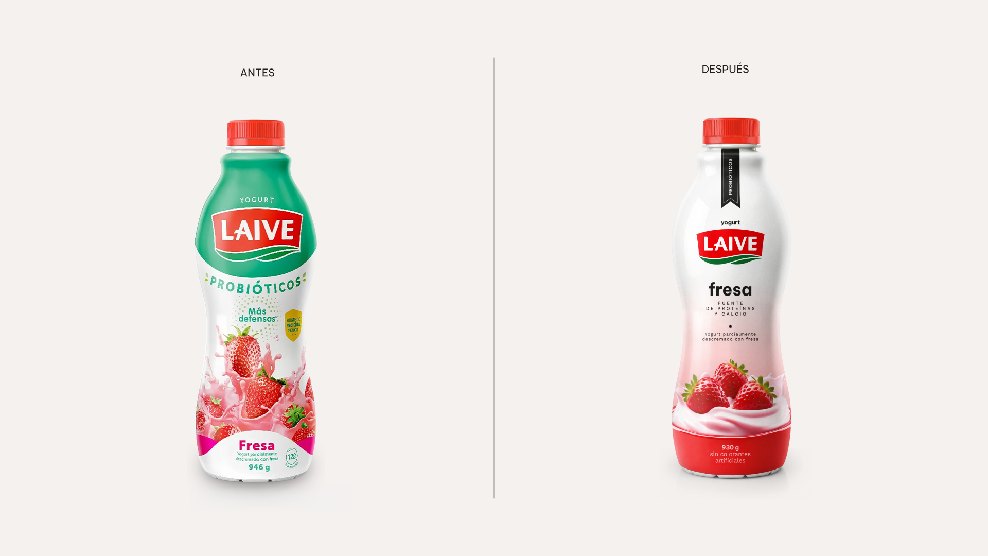
Laive came to us to renew the packaging of their yogurts. The challenge was to develop an attractive proposal without sacrificing brand recognition.
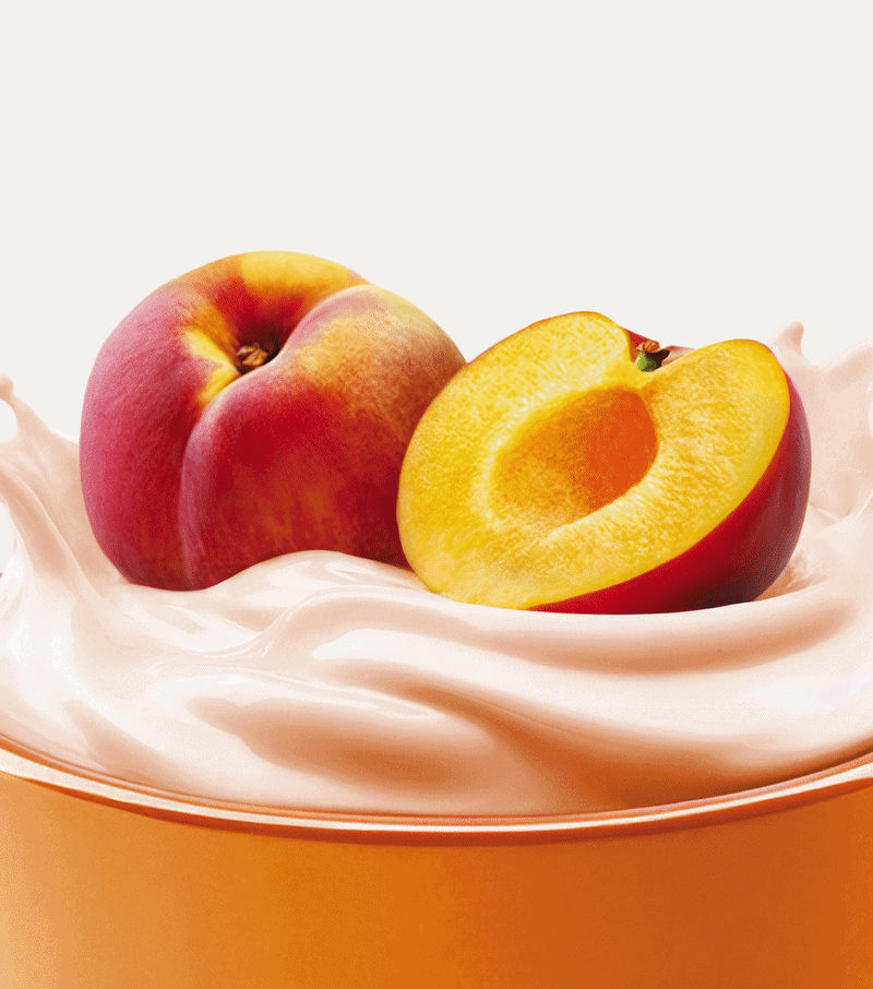
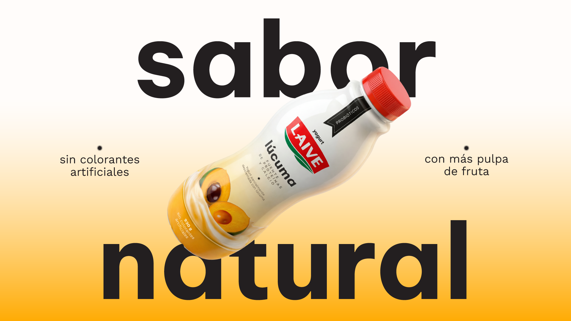
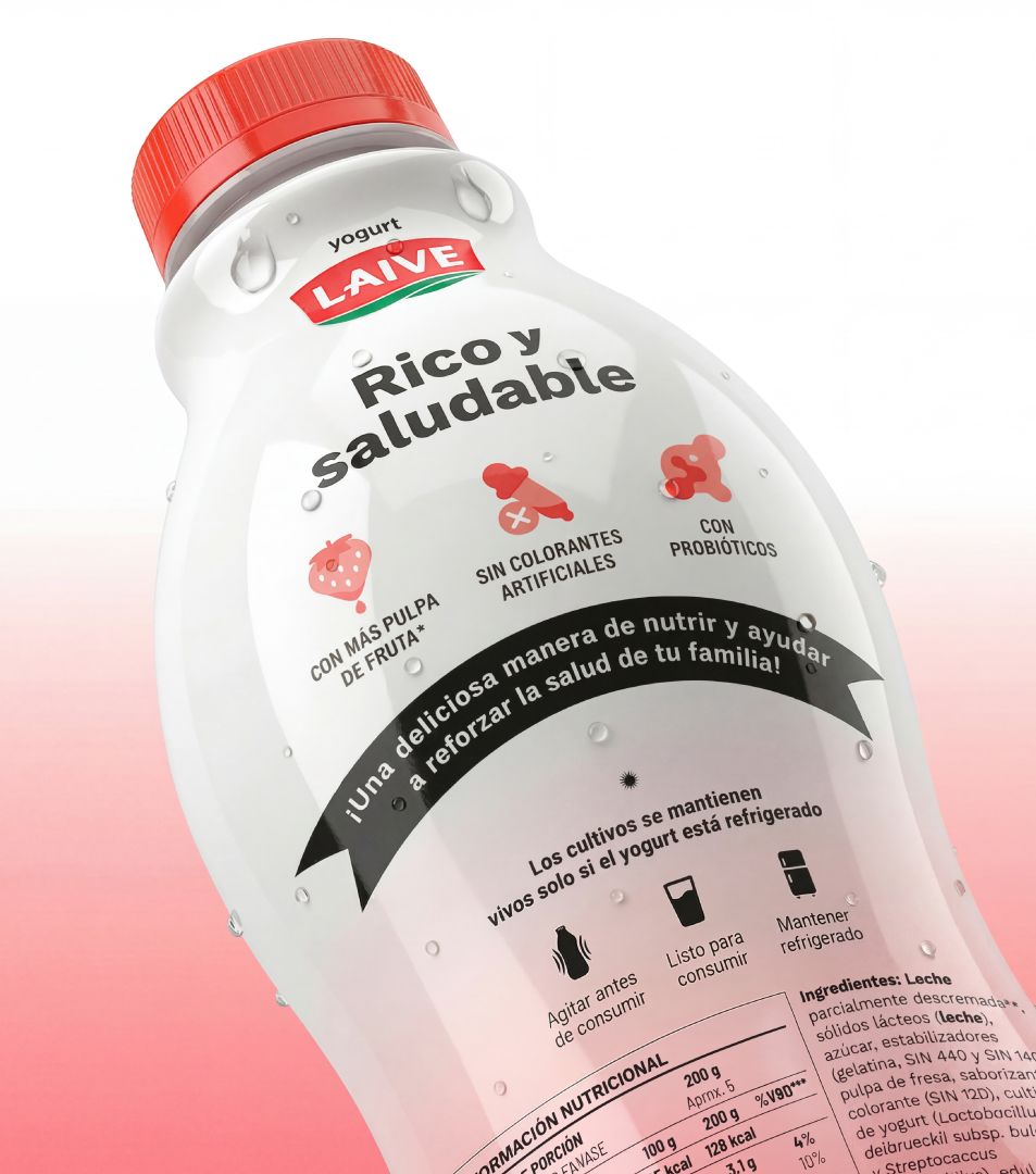
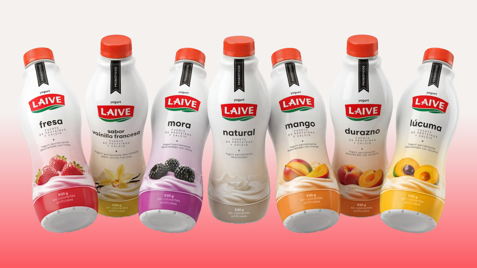
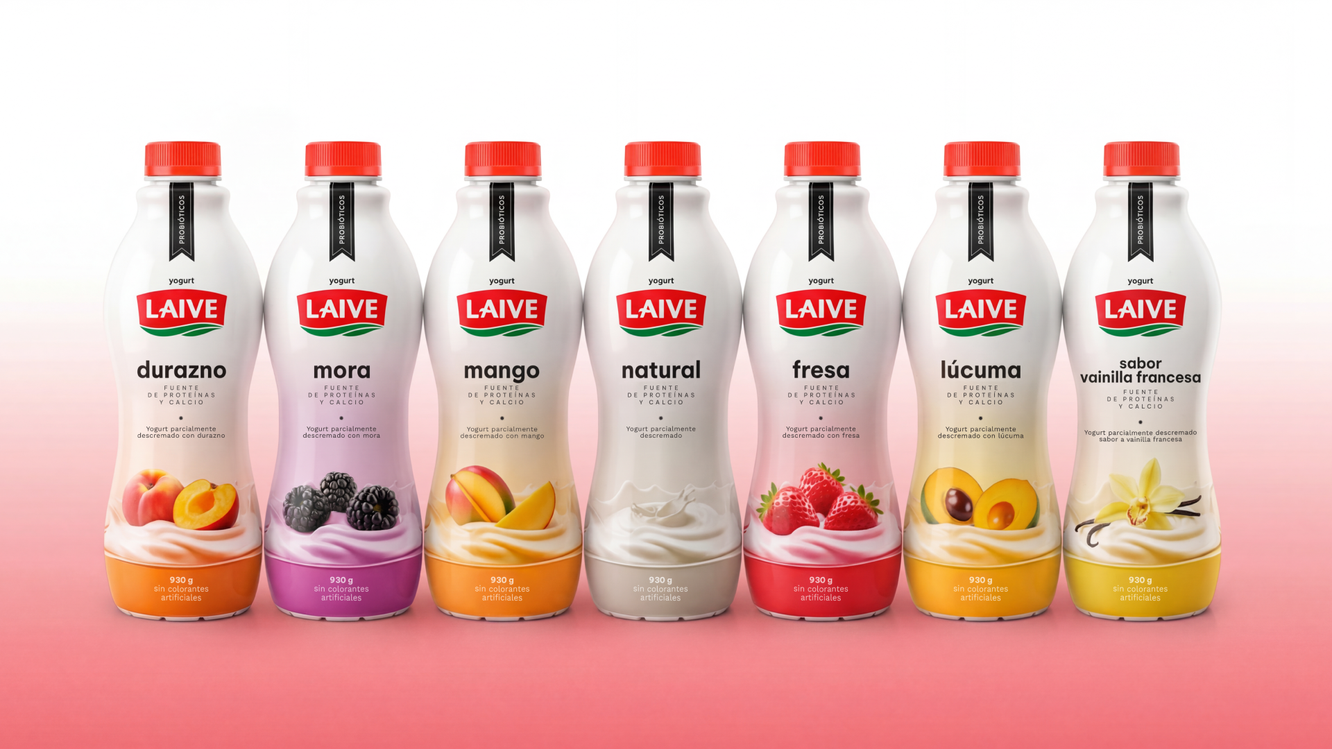
Laive, one of the leading dairy brands in Peru, renewed its line of yogurts with a recipe with more pulp, more creaminess and no artificial coloring. The assignment we were given was to develop the packaging, with the objective of achieving a coherent presence with the change, more attractive and competitive on the shelf, without losing the recognition built over time.
Over the years, the line had incorporated graphic resources that, although they sought to stand out, ended up distancing themselves from the brand’s own assets and took away from the brand’s consistency. In such a competitive environment, it was necessary to go back to basics: to organize the visual language and reinforce the identity.
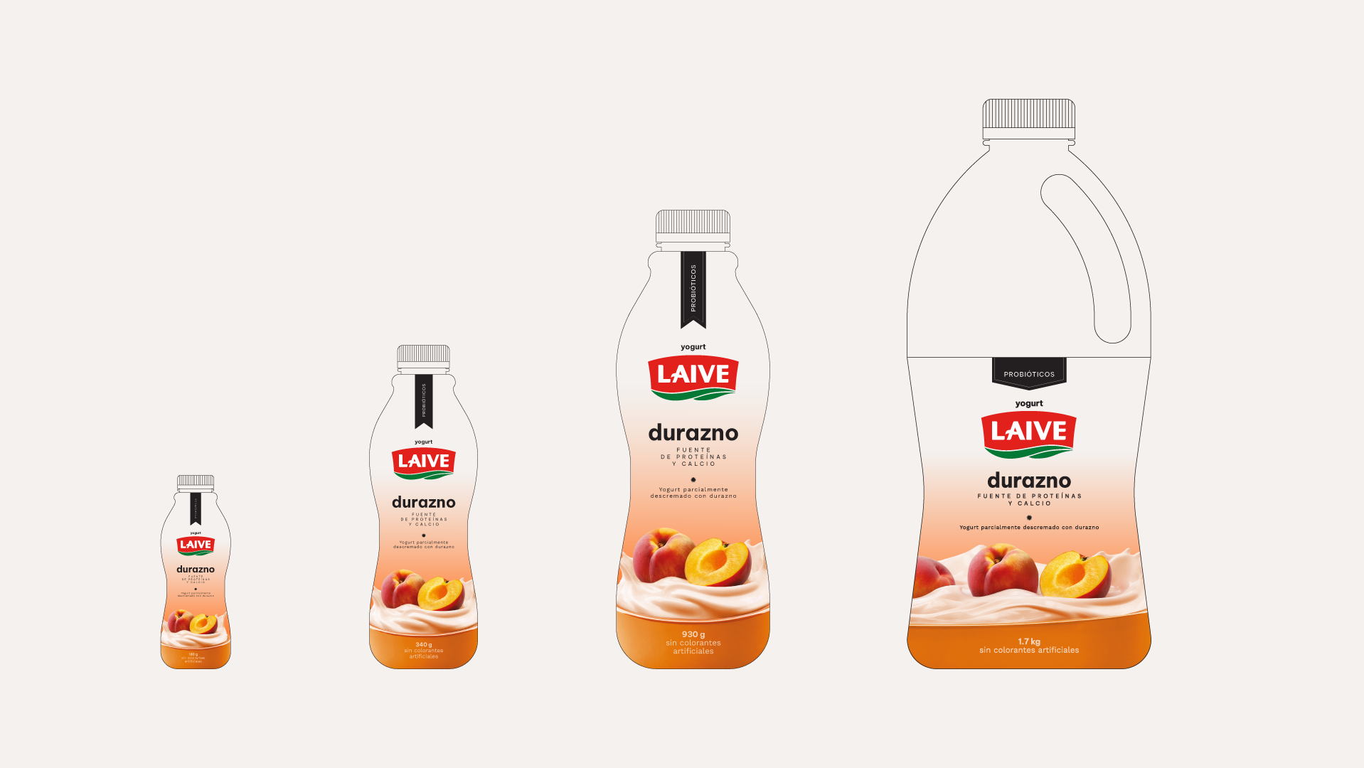
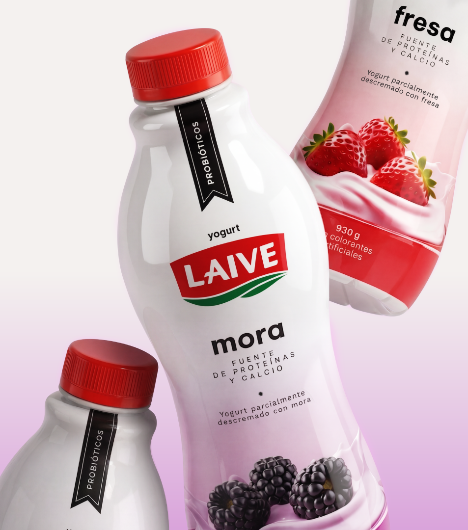
The work was both tactical and strategic. We eliminated colors foreign to the brand system and redesigned the yogurt and fruit illustrations, achieving cleaner, better organized and at the same time more provocative compositions. The result not only improves its performance at the point of sale, but also paves the way for the progressive renewal of other lines and products of the brand.