The world of ciders is often classic and artisanal in its visual language. So when Malamaña came to us with the promise of breaking tradition, we worked on an identity that would capture its freshness and irreverence.
The cider market has traditionally been associated with a classic, handcrafted image — brands that highlight heritage and centuries-old production methods. However, with the rise of innovative beverages targeting younger audiences, the need for a fresh, irreverent and different proposal arose.
In that context, Malamaña’s identity had to embody its disruptive spirit and connect with an audience seeking authentic, rule-free experiences. The challenge was to create a brand that stood out not only through its flavour but through its personality and voice.
The project involved the full development of Malamaña’s identity, from naming to packaging design.
The first step was the name. We needed something that would capture its rebellious essence and carefree attitude. That’s how Malamaña (literally “bad manner” in English) was born — an invitation to challenge convention and enjoy life without rules.
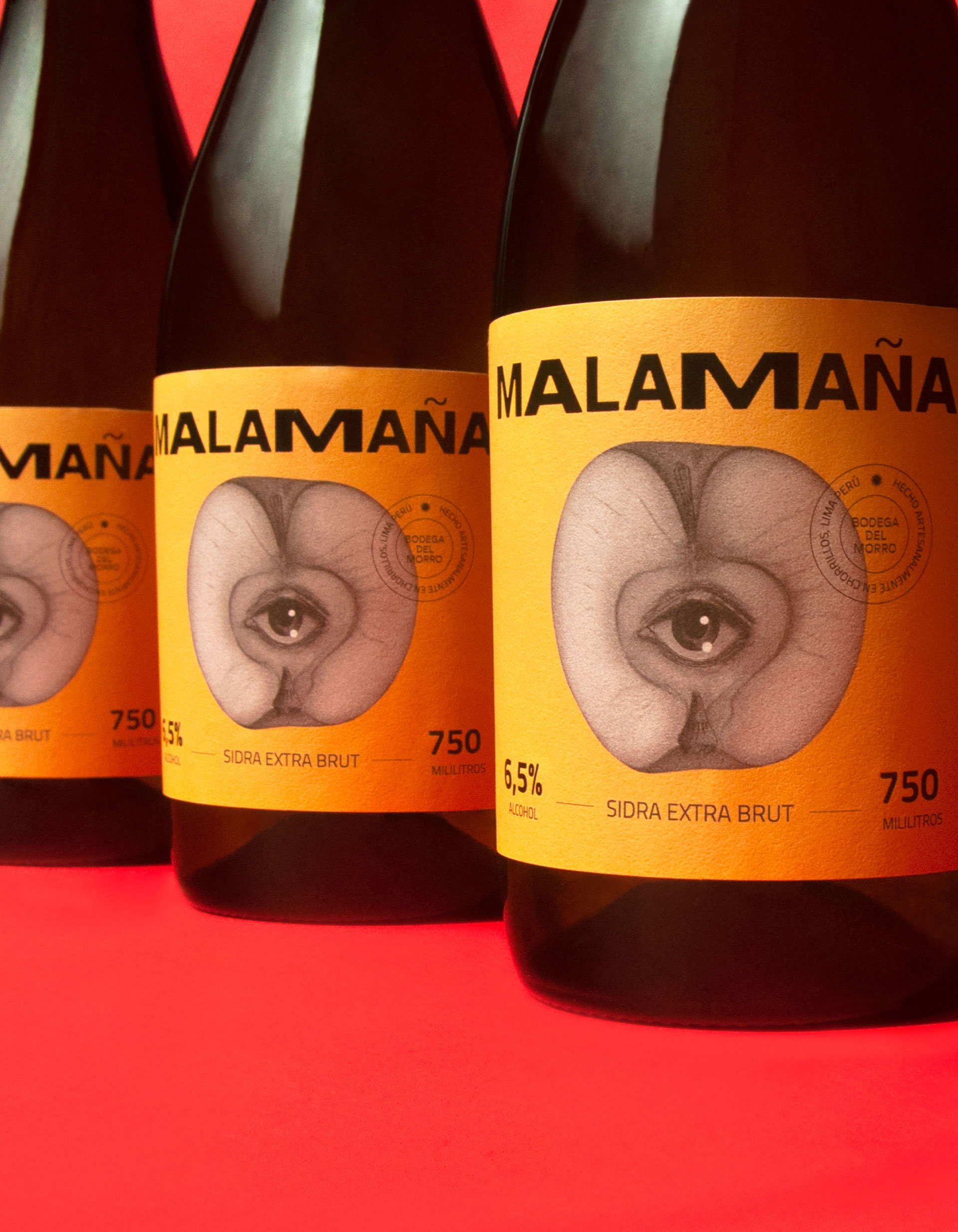
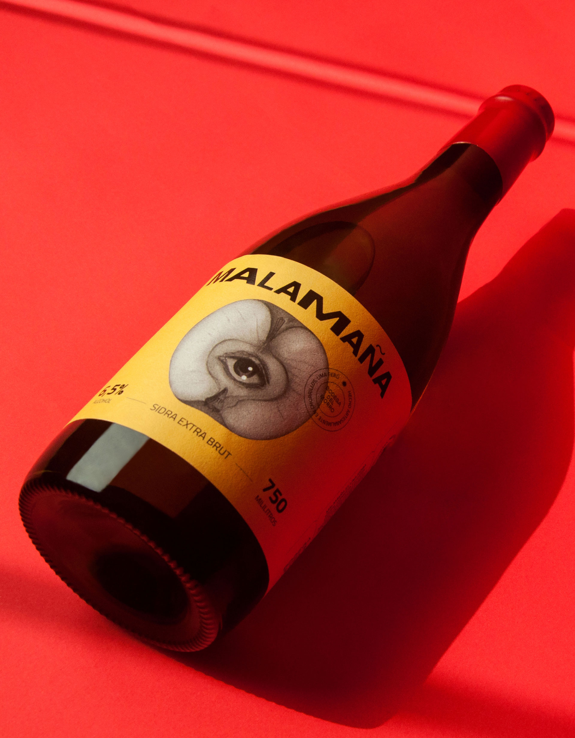
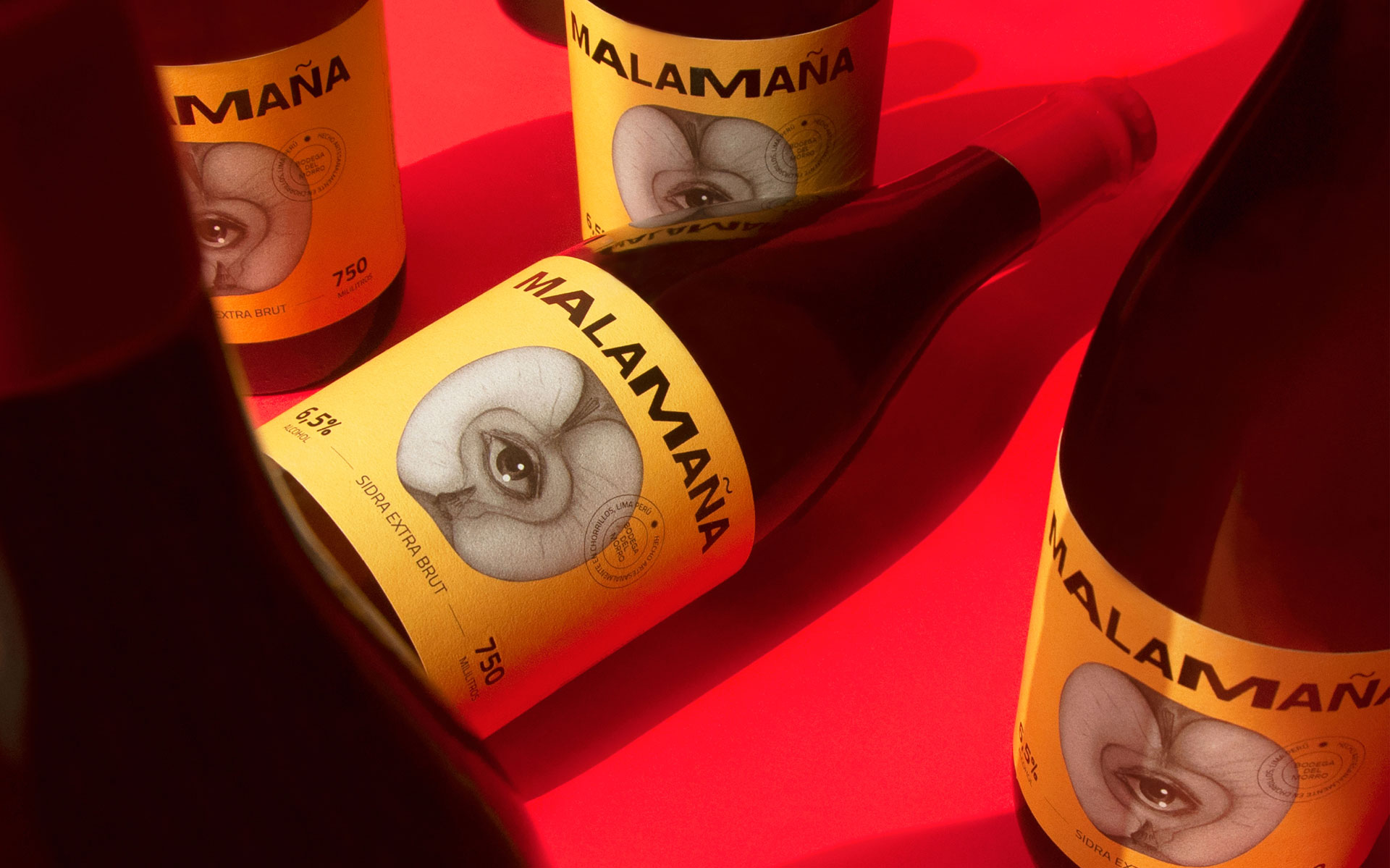
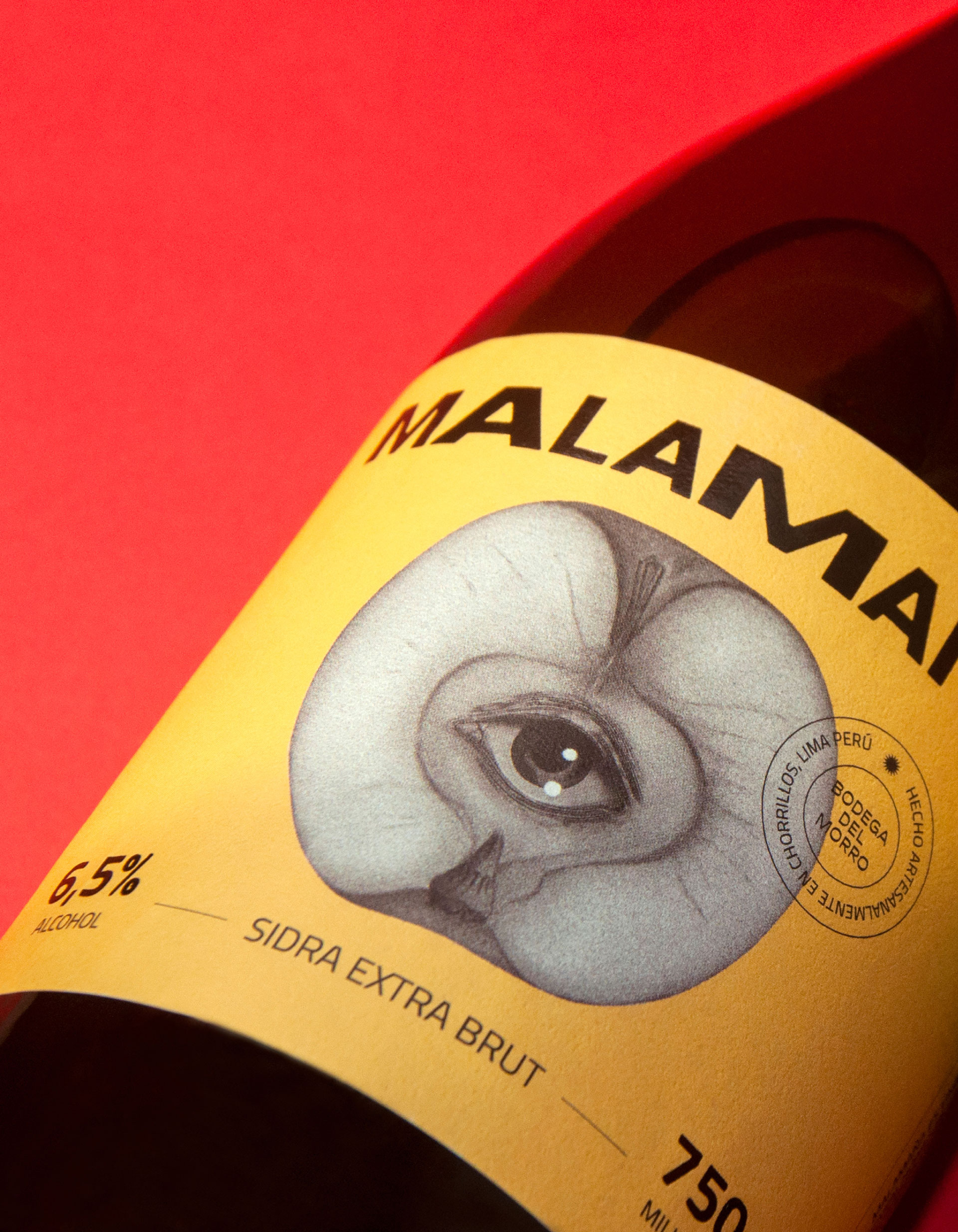
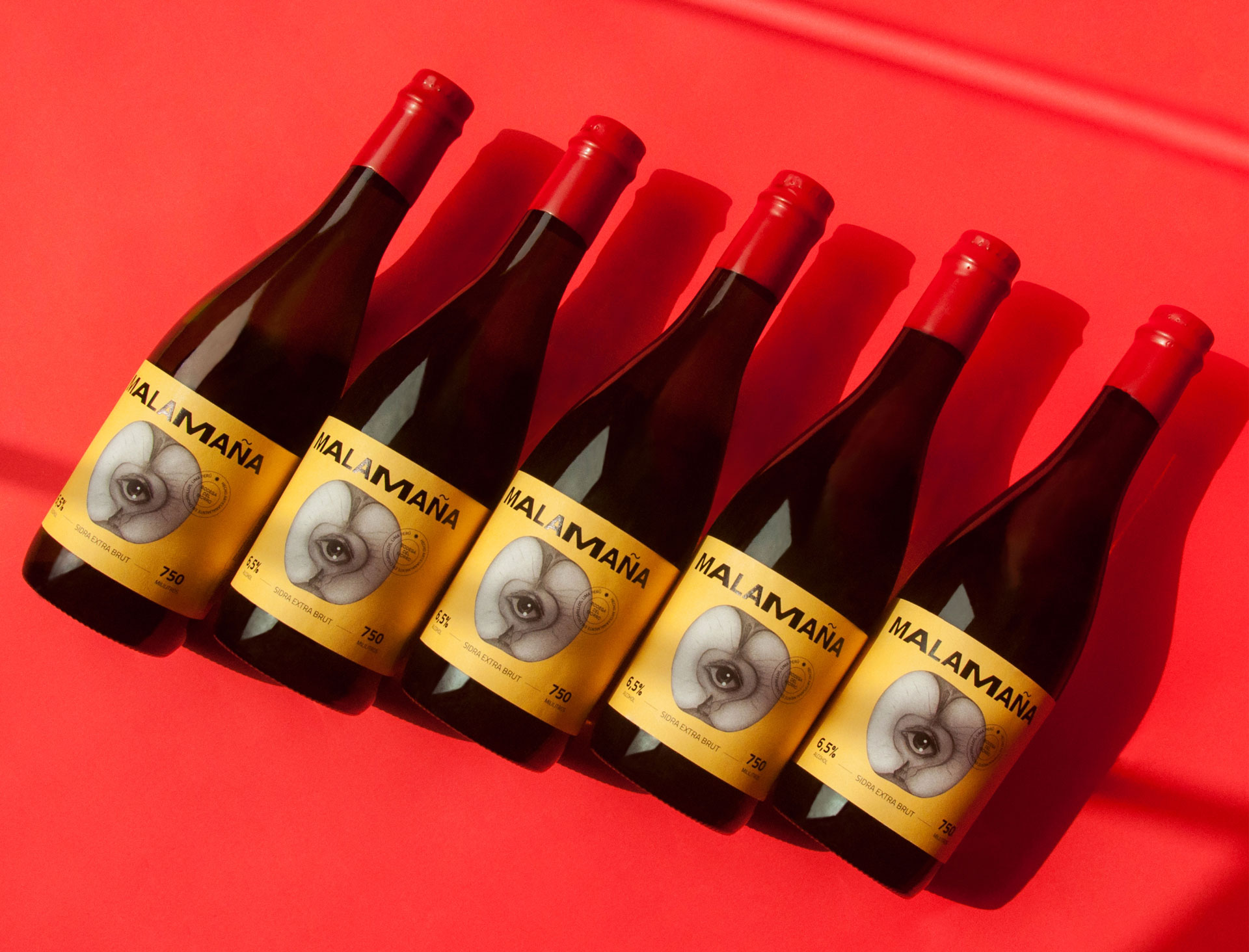
With the name defined, we designed packaging that reinforced its bold character. The apple — its core ingredient — became the visual centrepiece, lending its colours to the labels and starring in a vibrant illustration featuring an eye at its core, a premonition of the Malamaña experience.
A playful typeface and contrasting colour palette add energy and ensure the brand stands out on the shelf.
Beyond the visual aspect, we developed a storytelling approach that connects with a young audience drawn to authenticity and spontaneity. Malamaña is not just a cider — it’s an invitation to see the day differently.