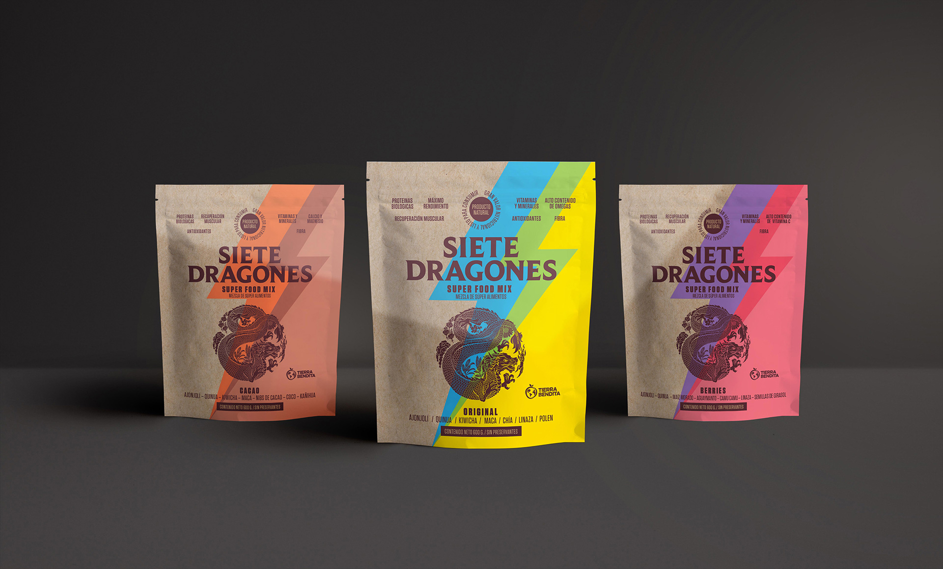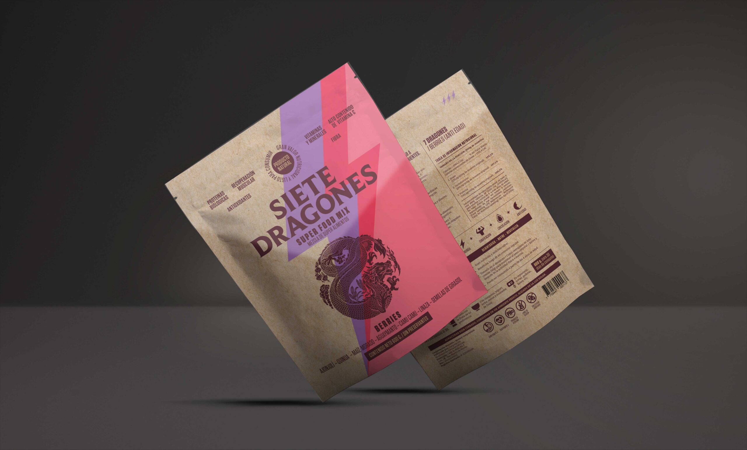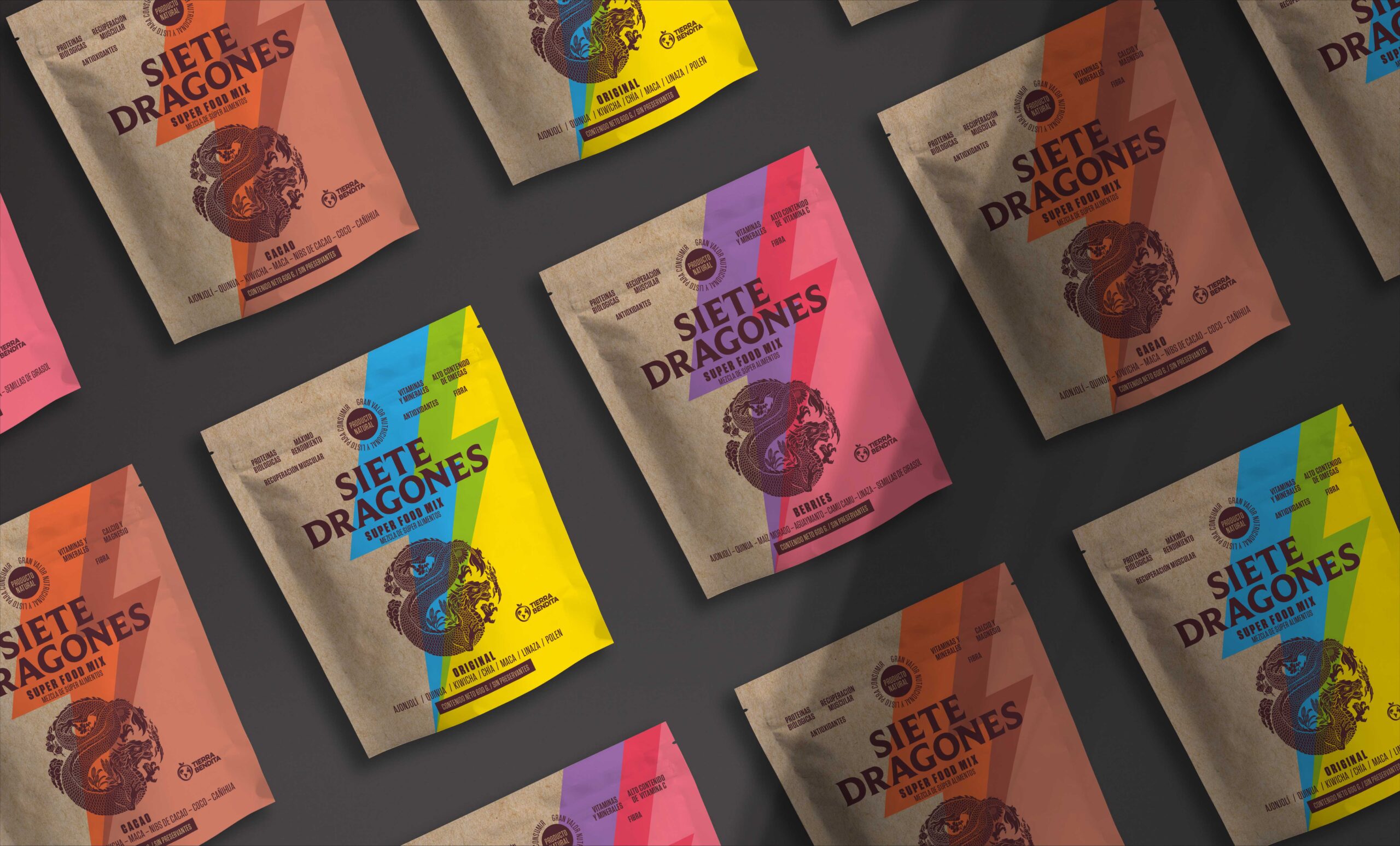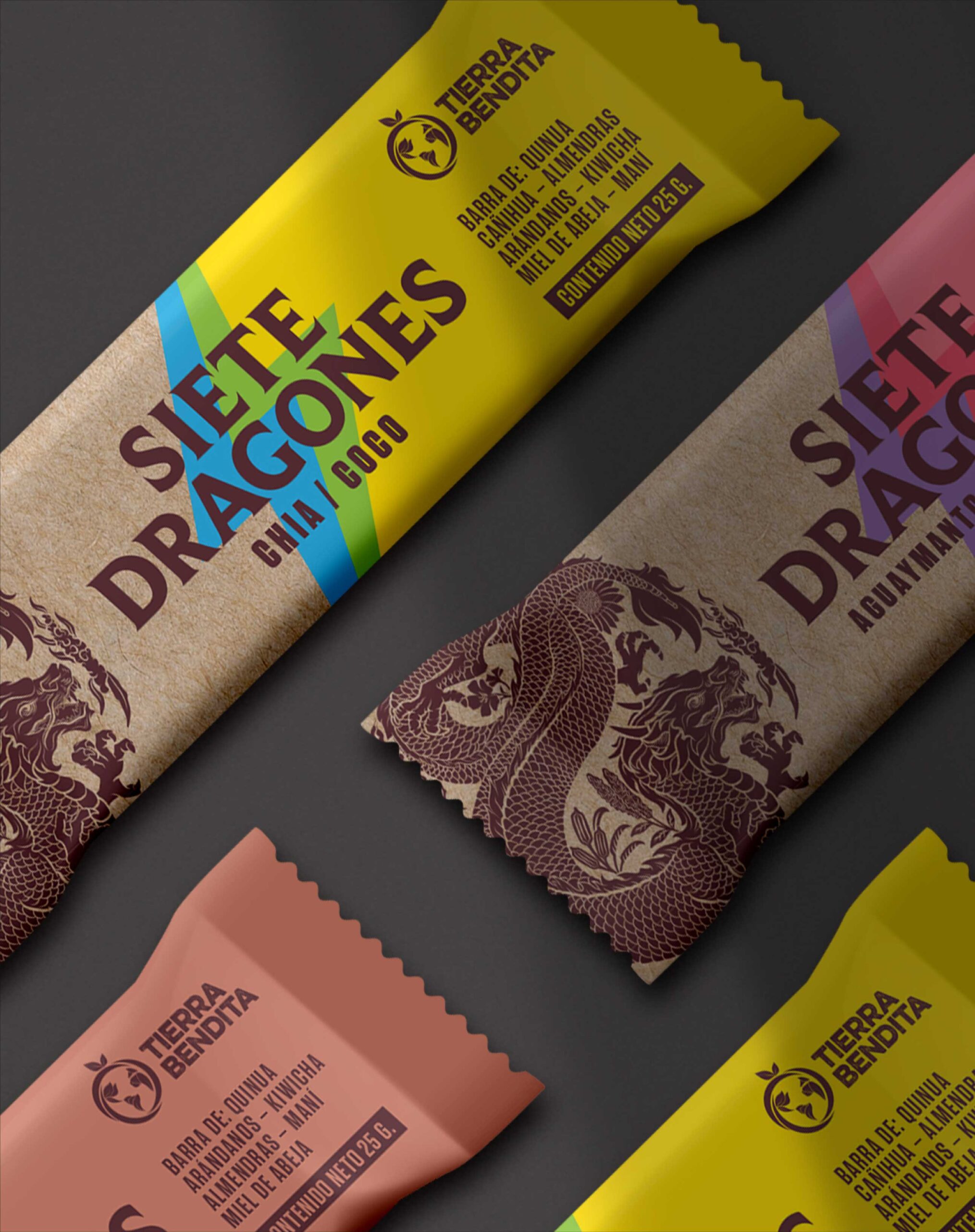
7 Dragones’ products are conceived under the premise that their consumers can achieve a positive change through better athletic performance and organic nourishment. To accomplish this purpose, it needed its brand and packaging to be redesigned.
Food is our main source of energy, nevertheless very few of us stop to think if what we’re eating is something that contributes to giving our body strength and vitality This is where 7 Dragones and its purpose enter the scene.
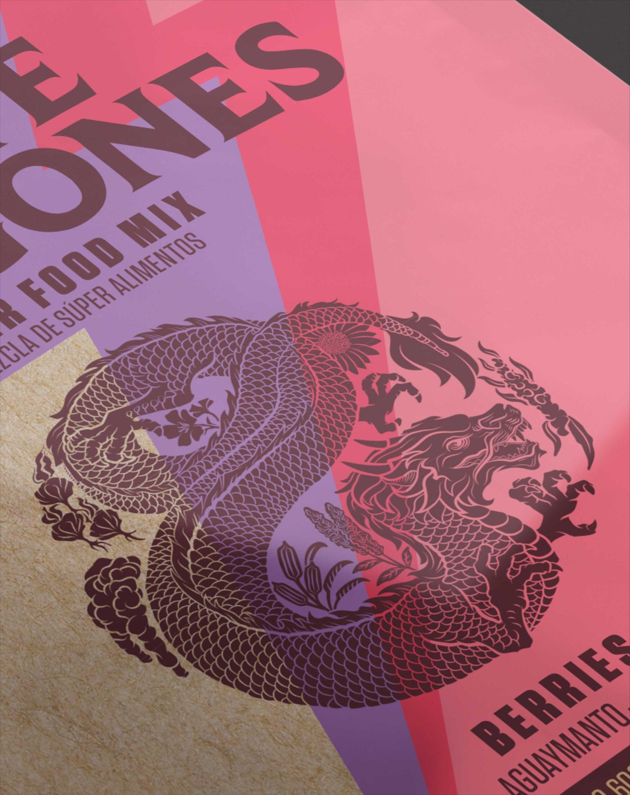
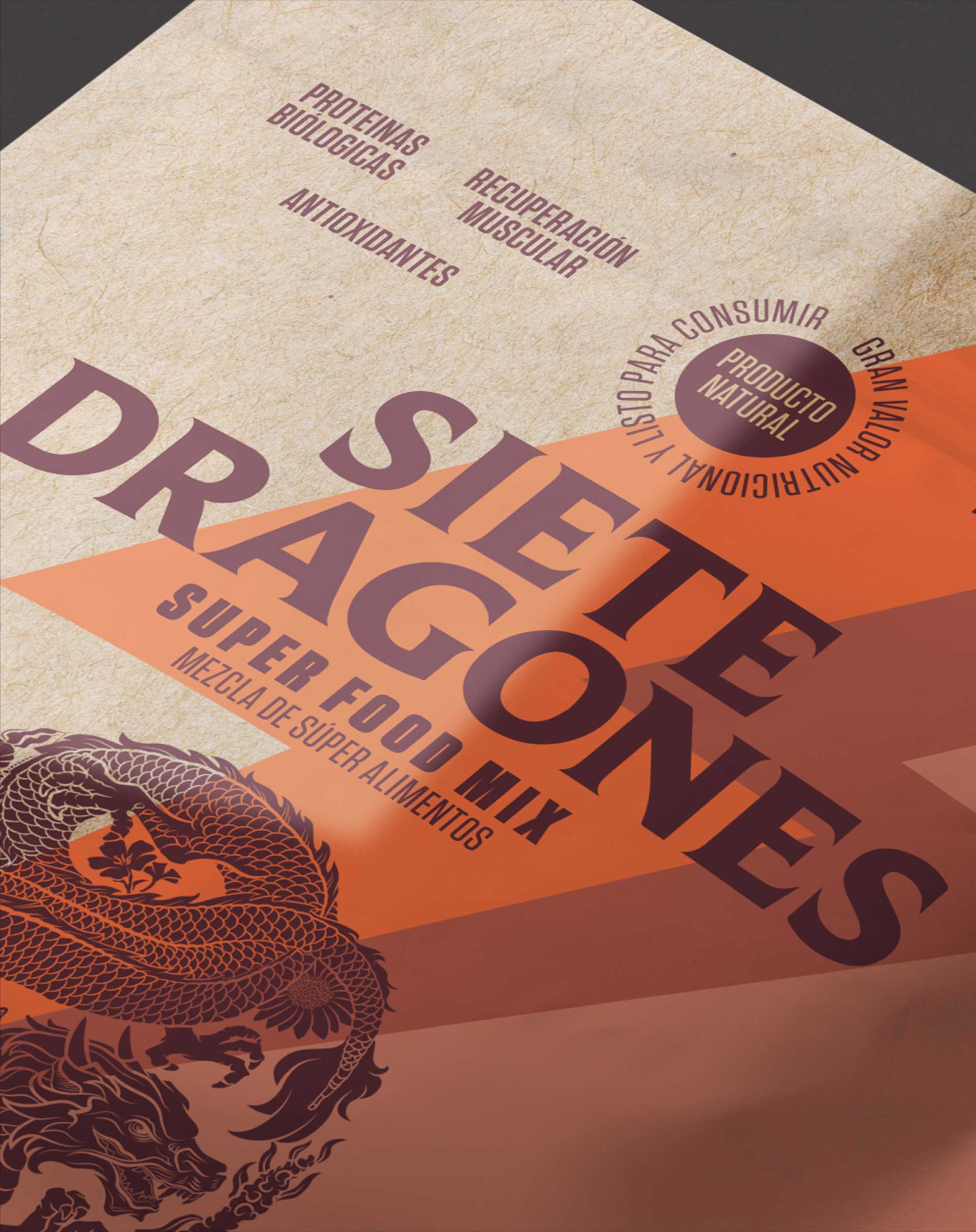
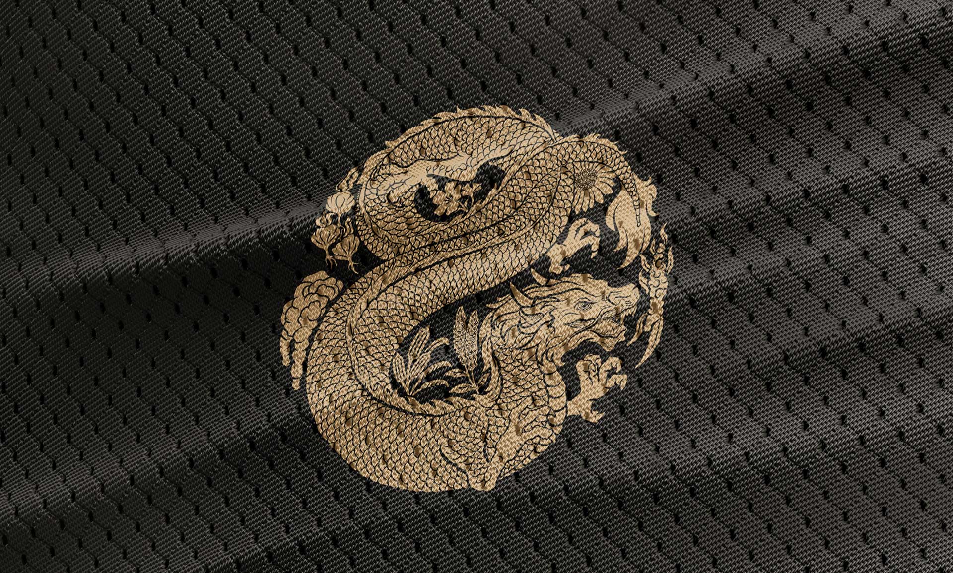
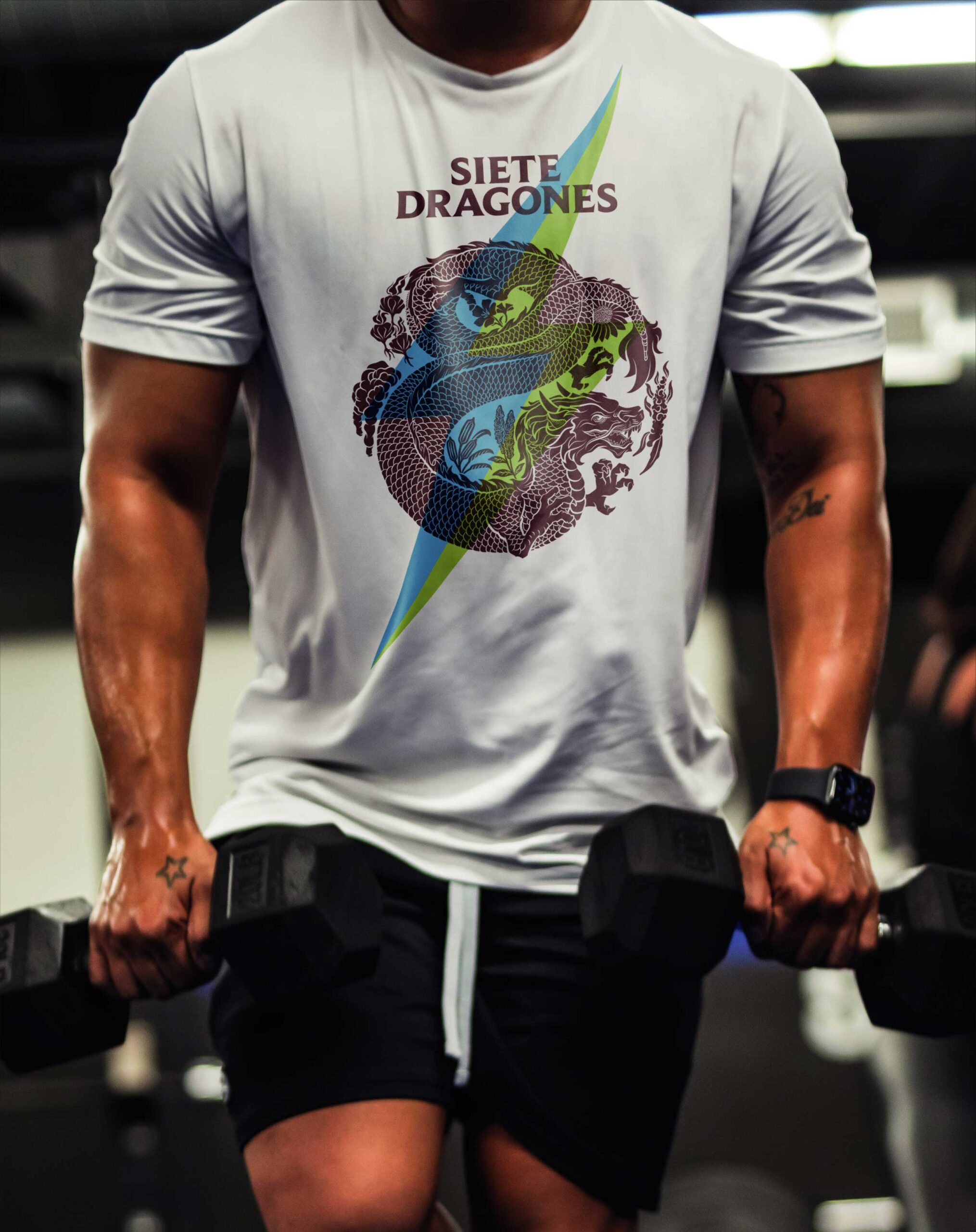
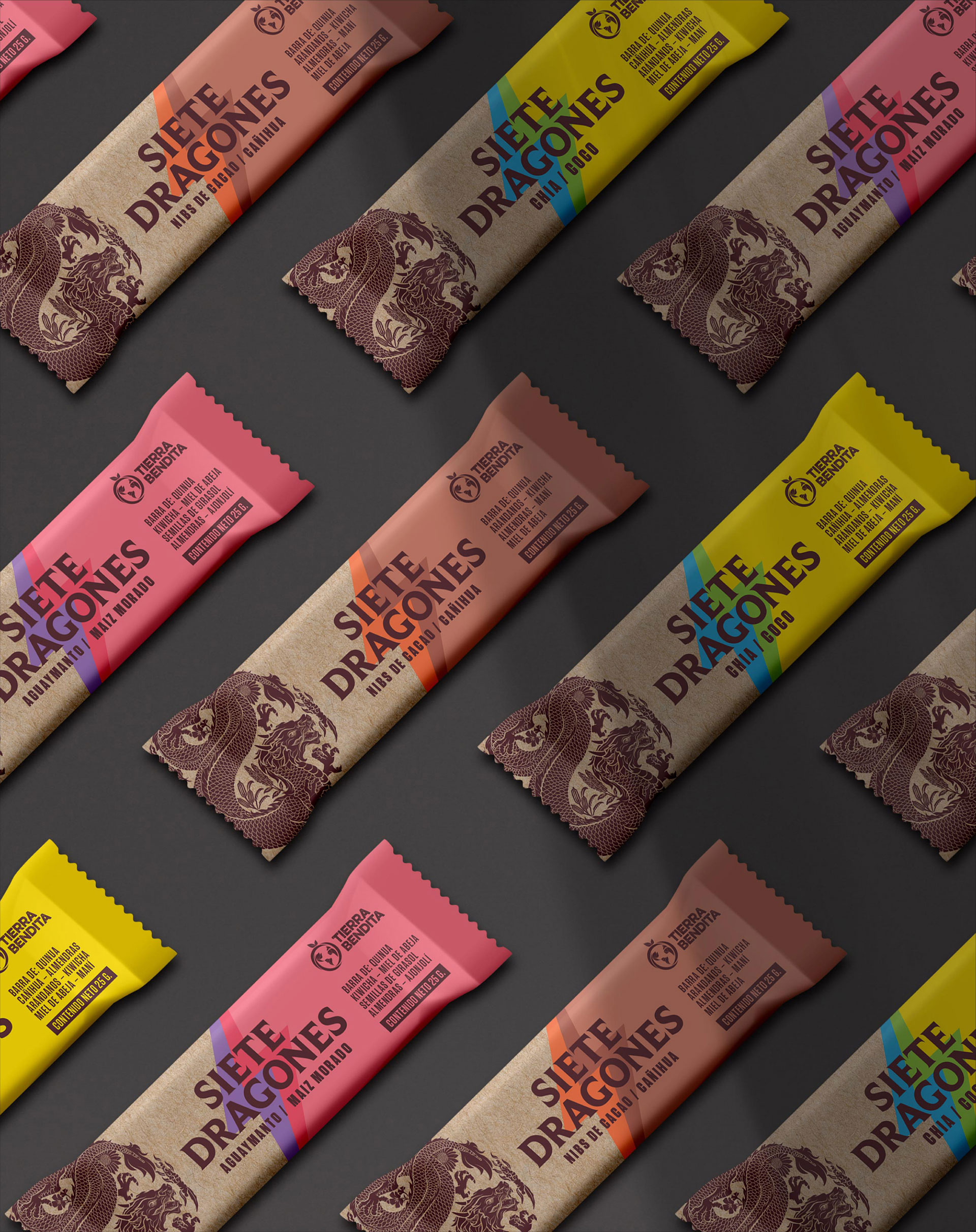
Our creative process started by setting a communication strategy, where we collaborated to redefine the target audience and how we could better understand their mindset and empathize with them. This gave us the necessary input to design a visual system in which graphic resources of both energy and natural products converged spontaneously.
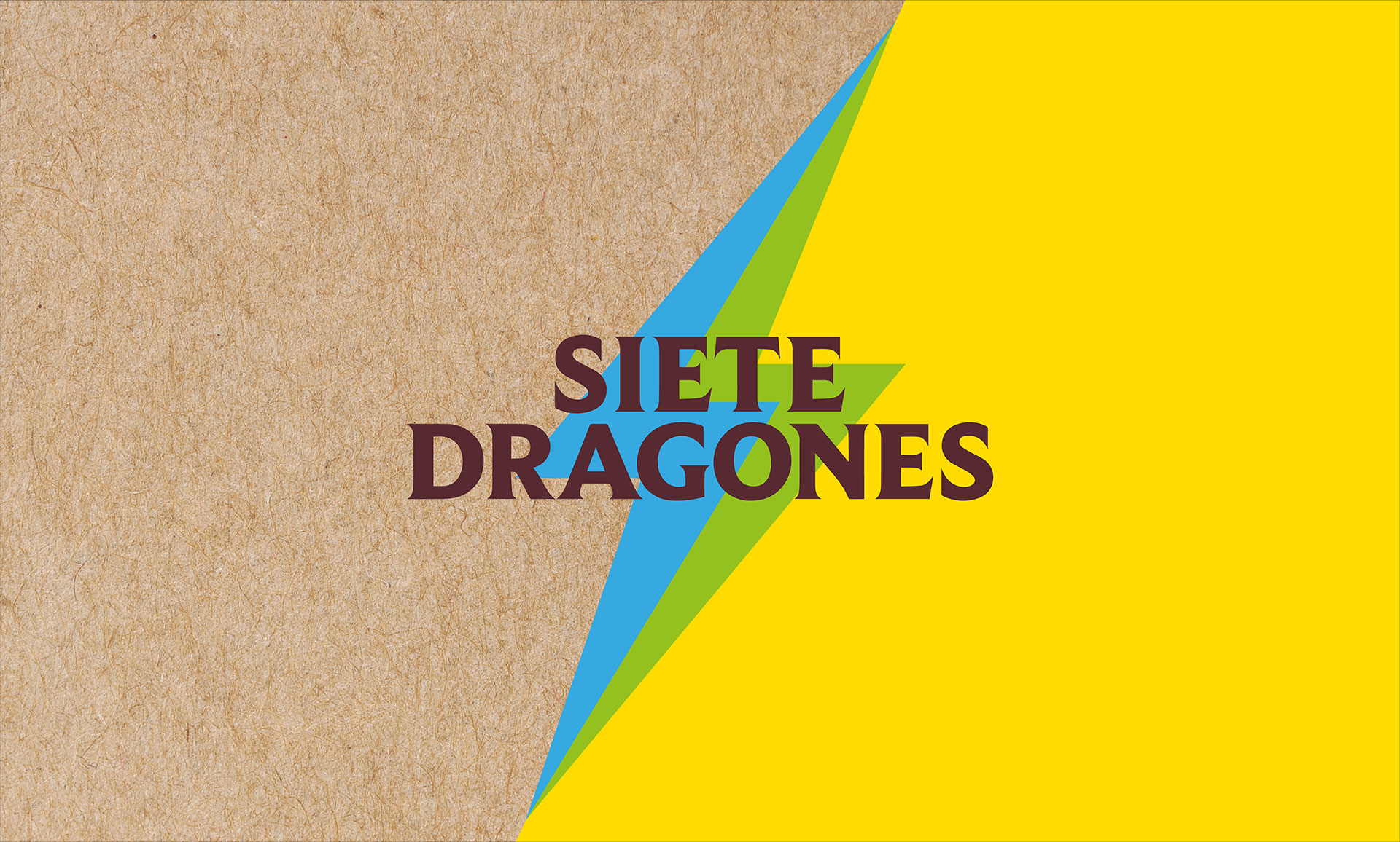
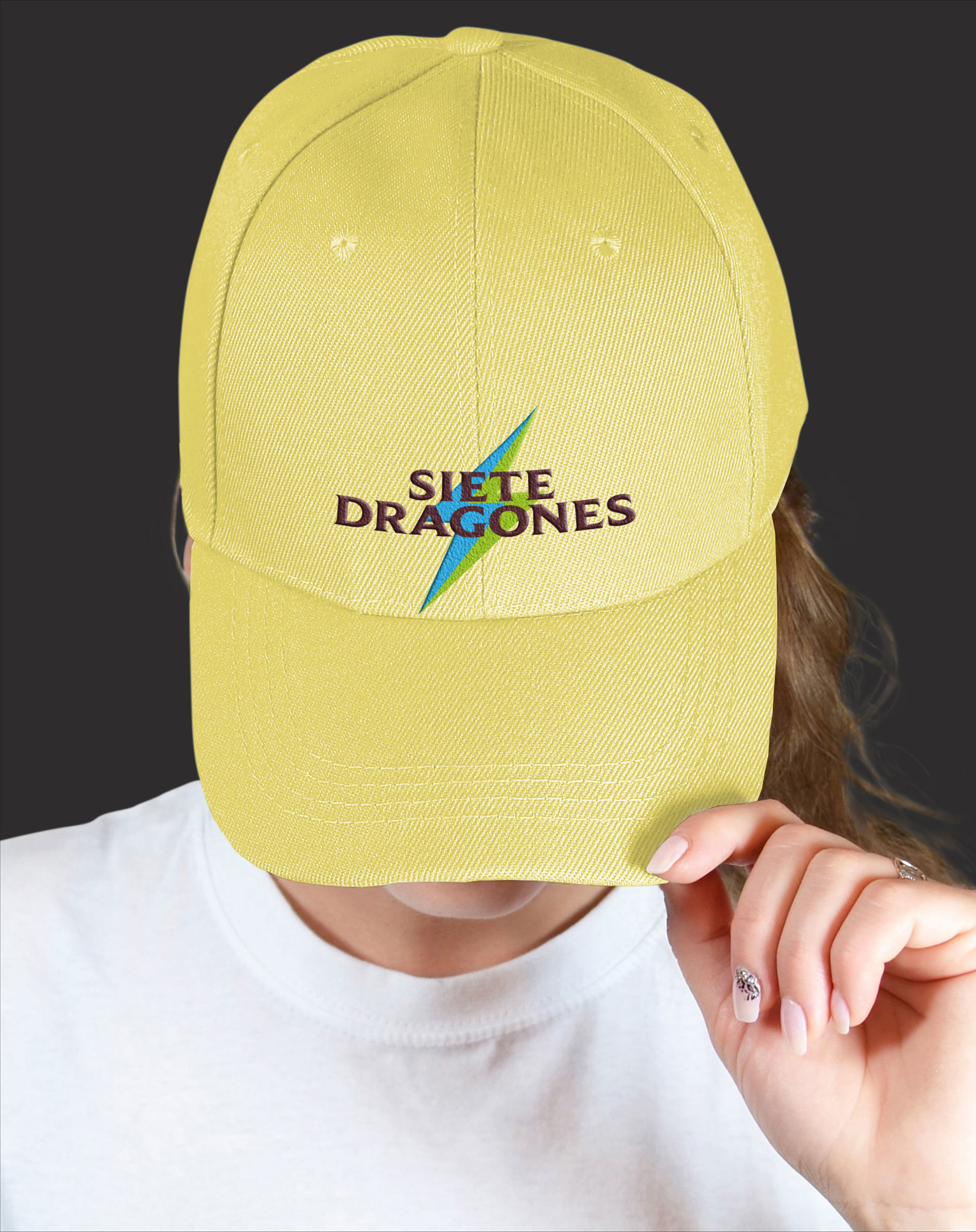
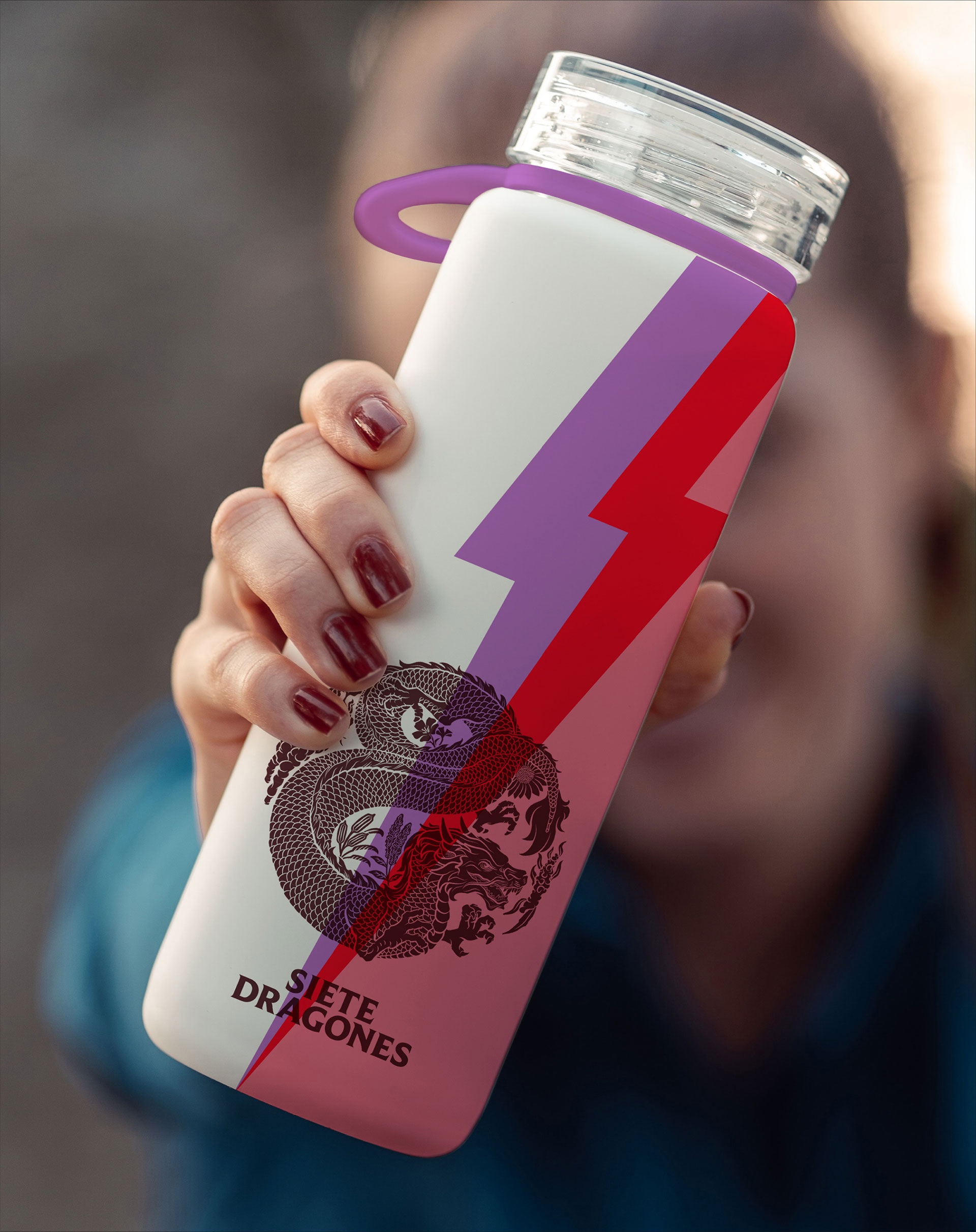
The result? A more impactful brand whose packaging conveys a simple yet clear message: natural is the best kind of energy.