Echecopar is one of the most important and long-standing law firms in Peru. Upon reaching its 75th anniversary, and in the midst of a process of change, they reached out to us to modernize their brand and consolidate an identity that reflects not only their prestige but also their projection into the future.
After being the first Peruvian law firm associated with an international practice, Echecopar parted ways with Baker McKenzie in mid-2025. Carrying out that transition during their 75th anniversary became an opportunity to look to the future with enthusiasm and ambition while honoring their legacy and reputation.
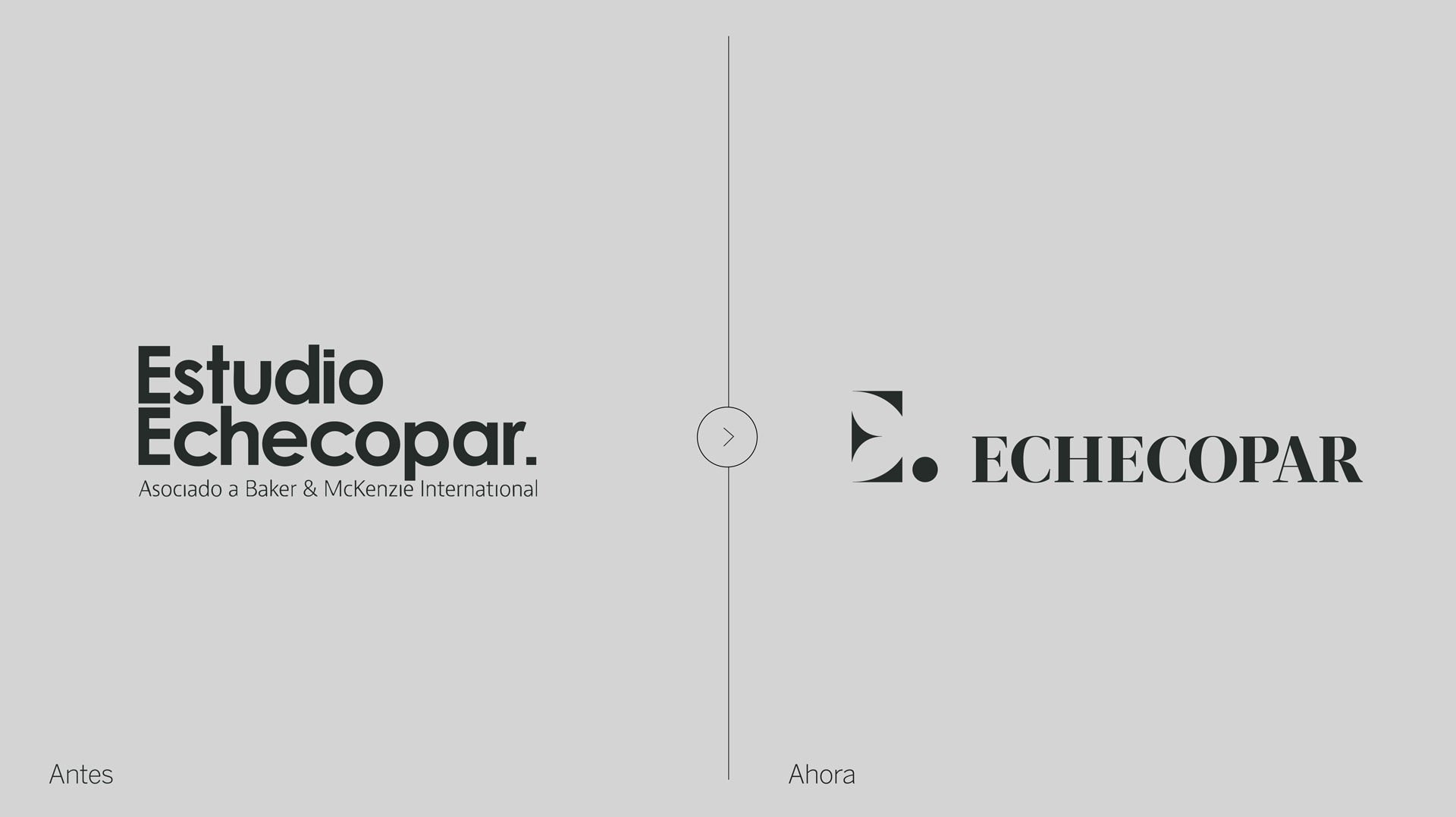
Our work began with more than twenty in-depth interviews (with senior partners and top management) and an analysis of the international market. From that stage came one of our initial proposals to modernize the brand: to drop the word “Estudio” from the name and simply be Echecopar.
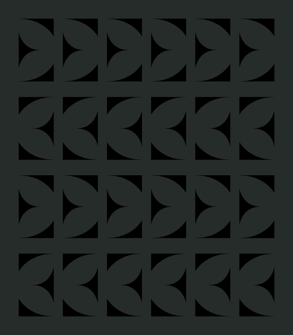
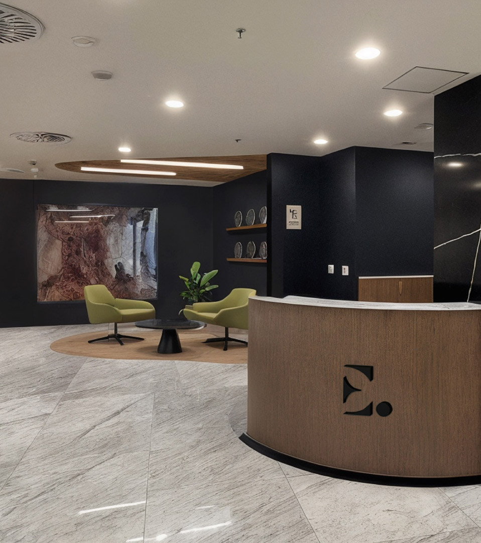
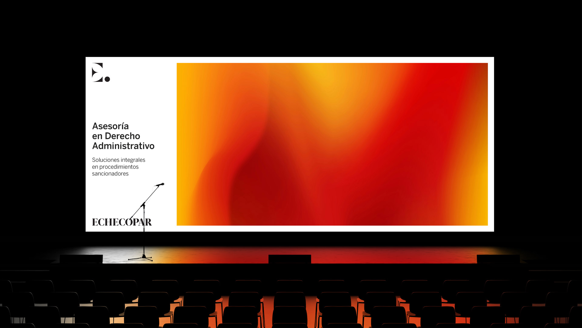
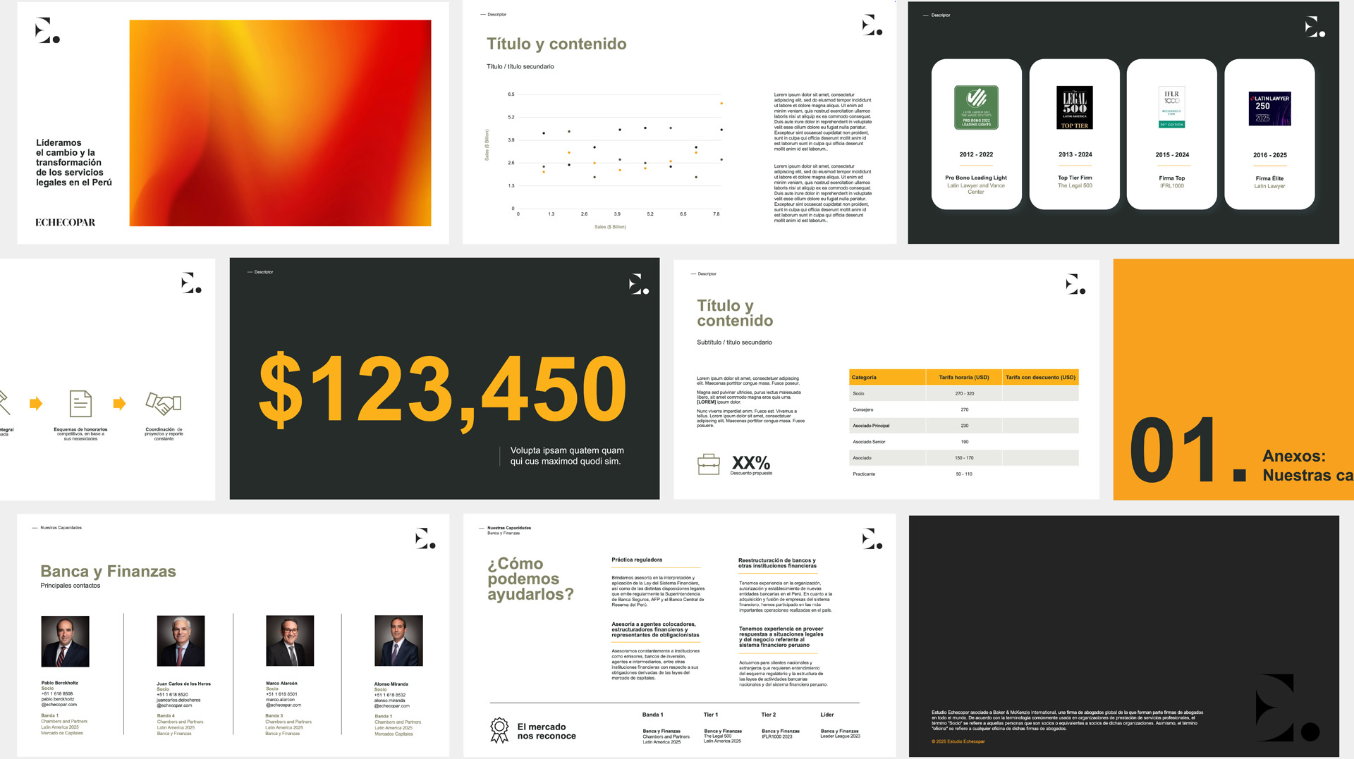
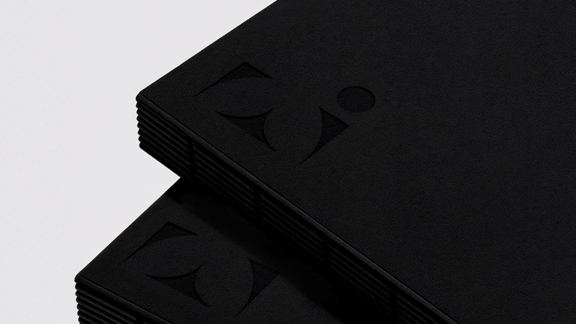
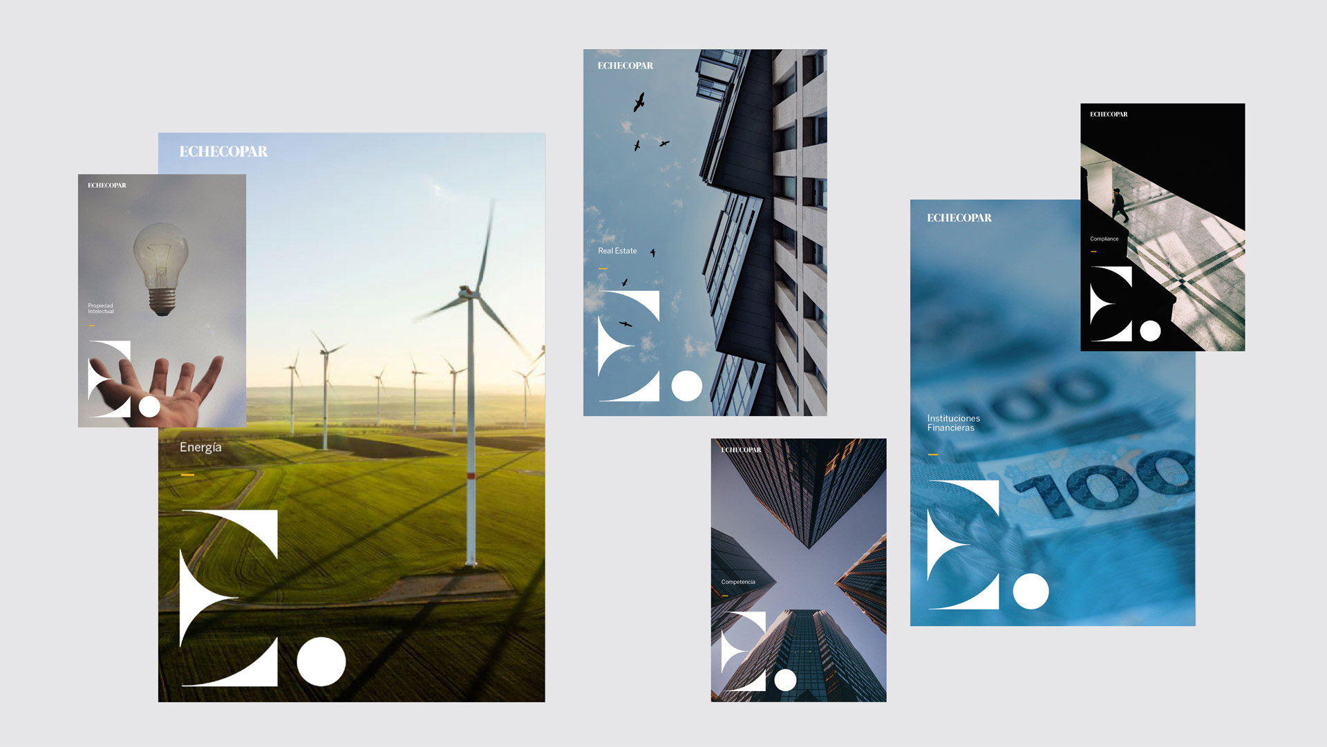
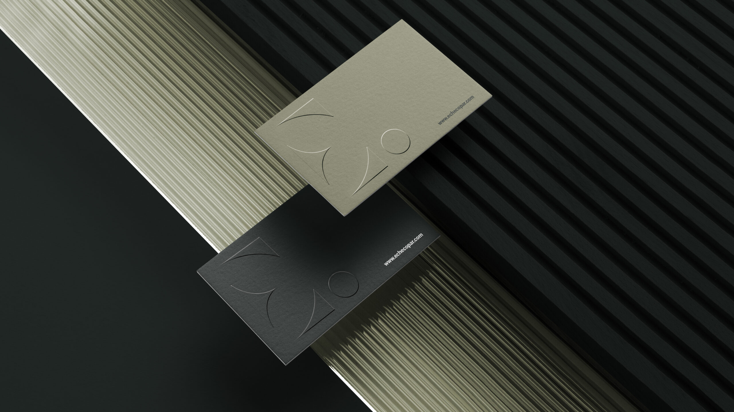
With the name change, we proceeded to design the new logo with a clear objective: to reflect a top-tier firm with excellence as the standard. We moved from a bold, linear typeface to a more elegant serif. From this emerged an isotype based on the reconstruction of the letter E, whose forms allowed us to create a dynamic, recognizable visual system across touchpoints — from office signage to the website and merchandising.