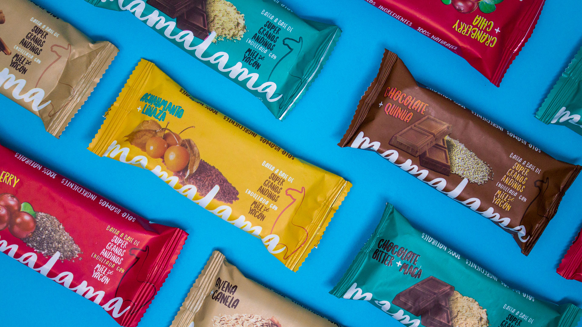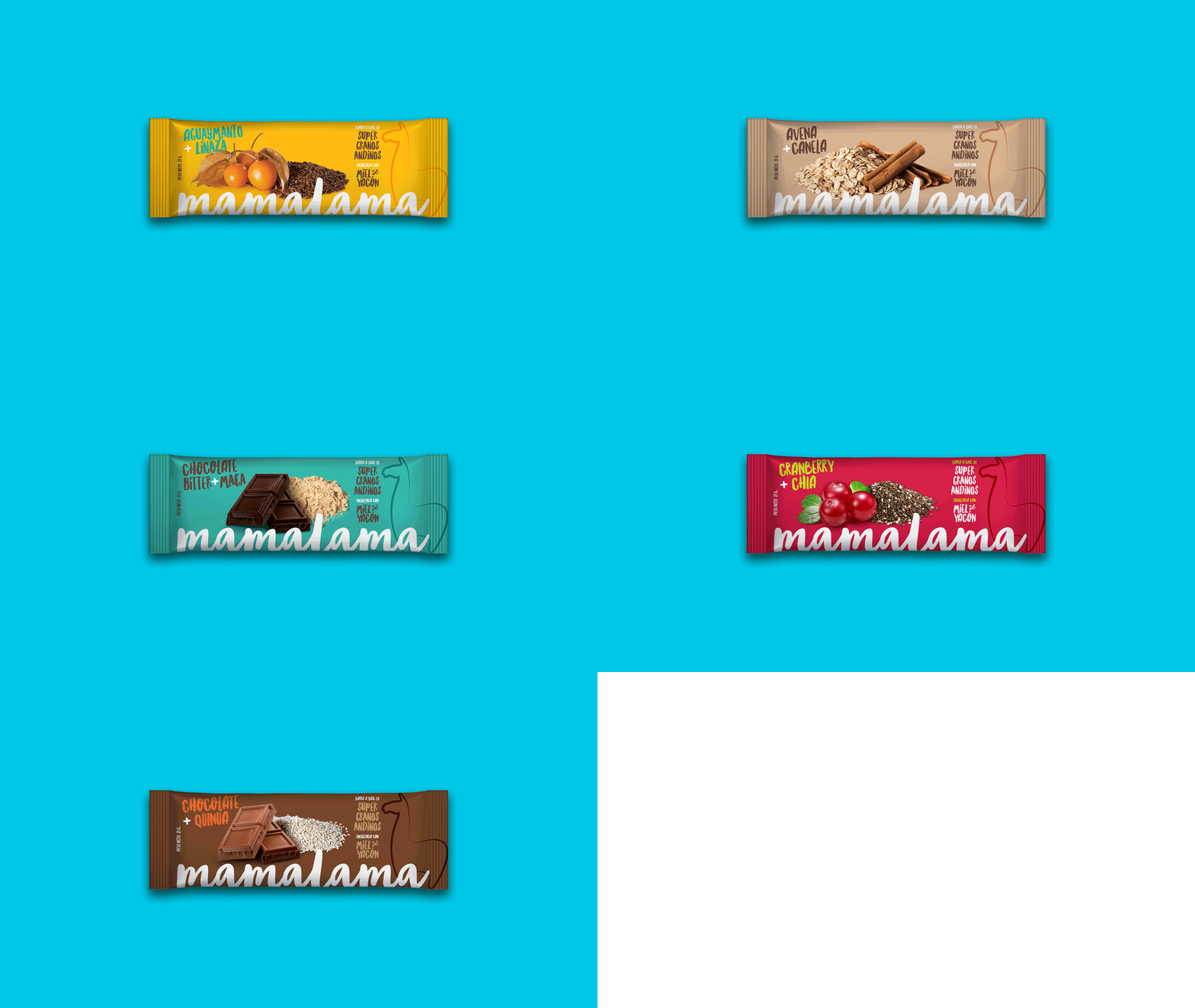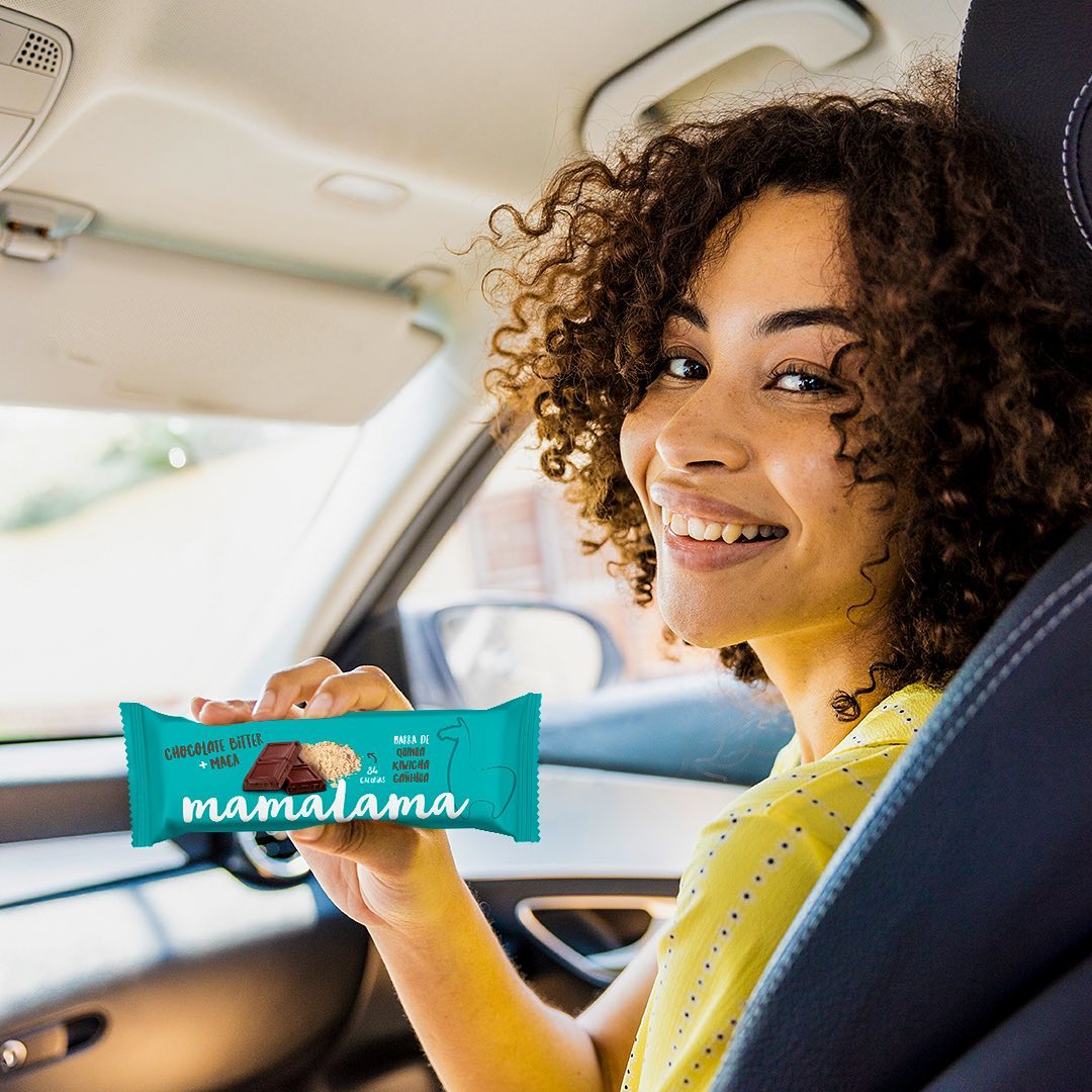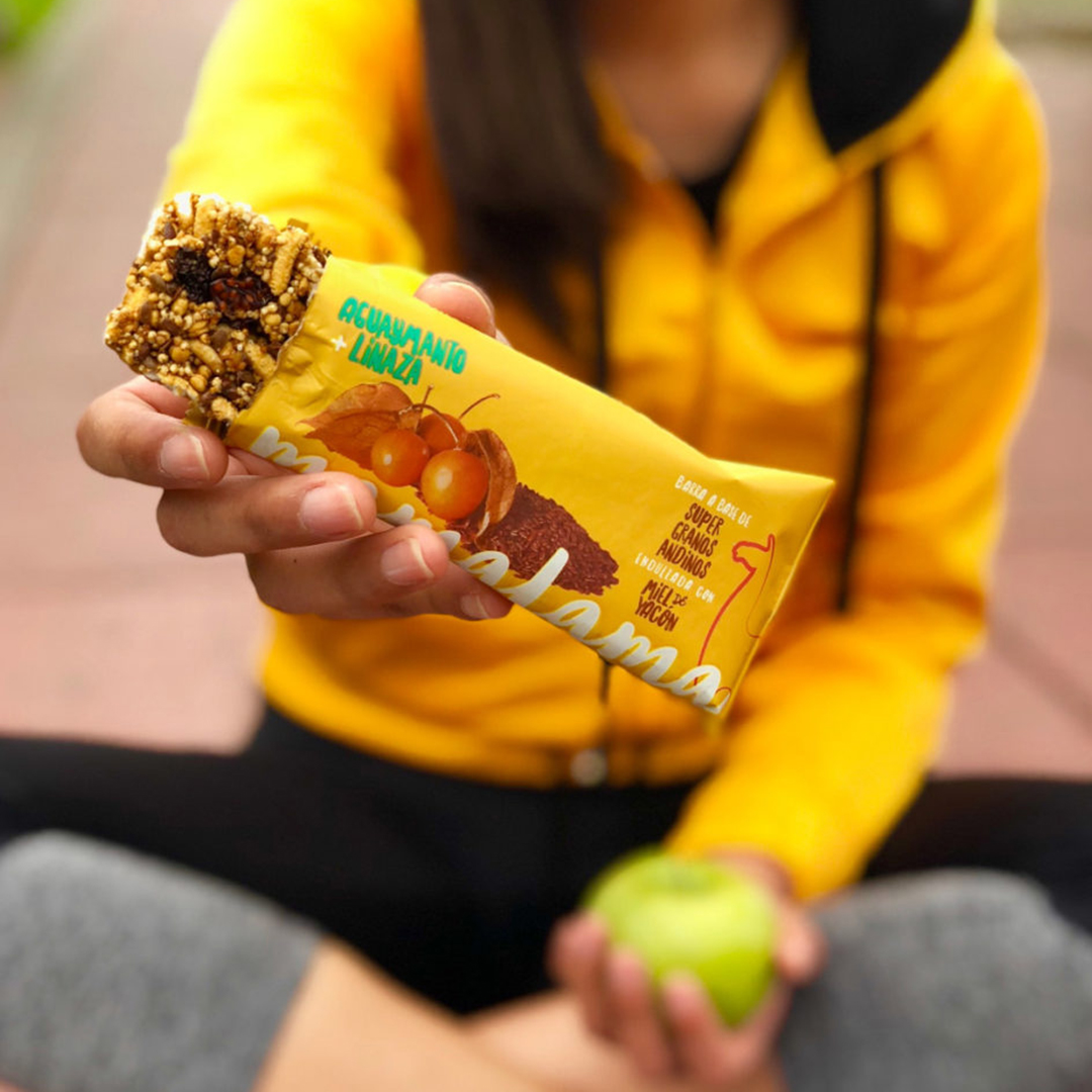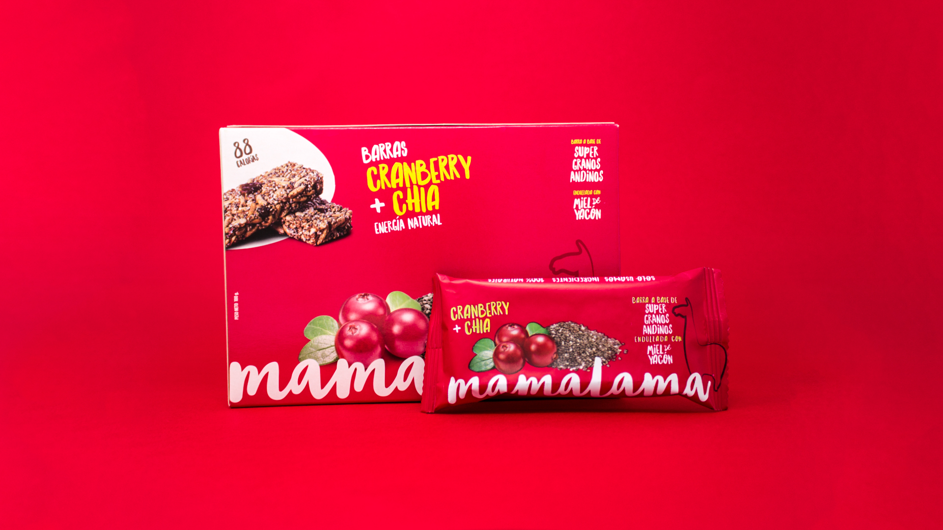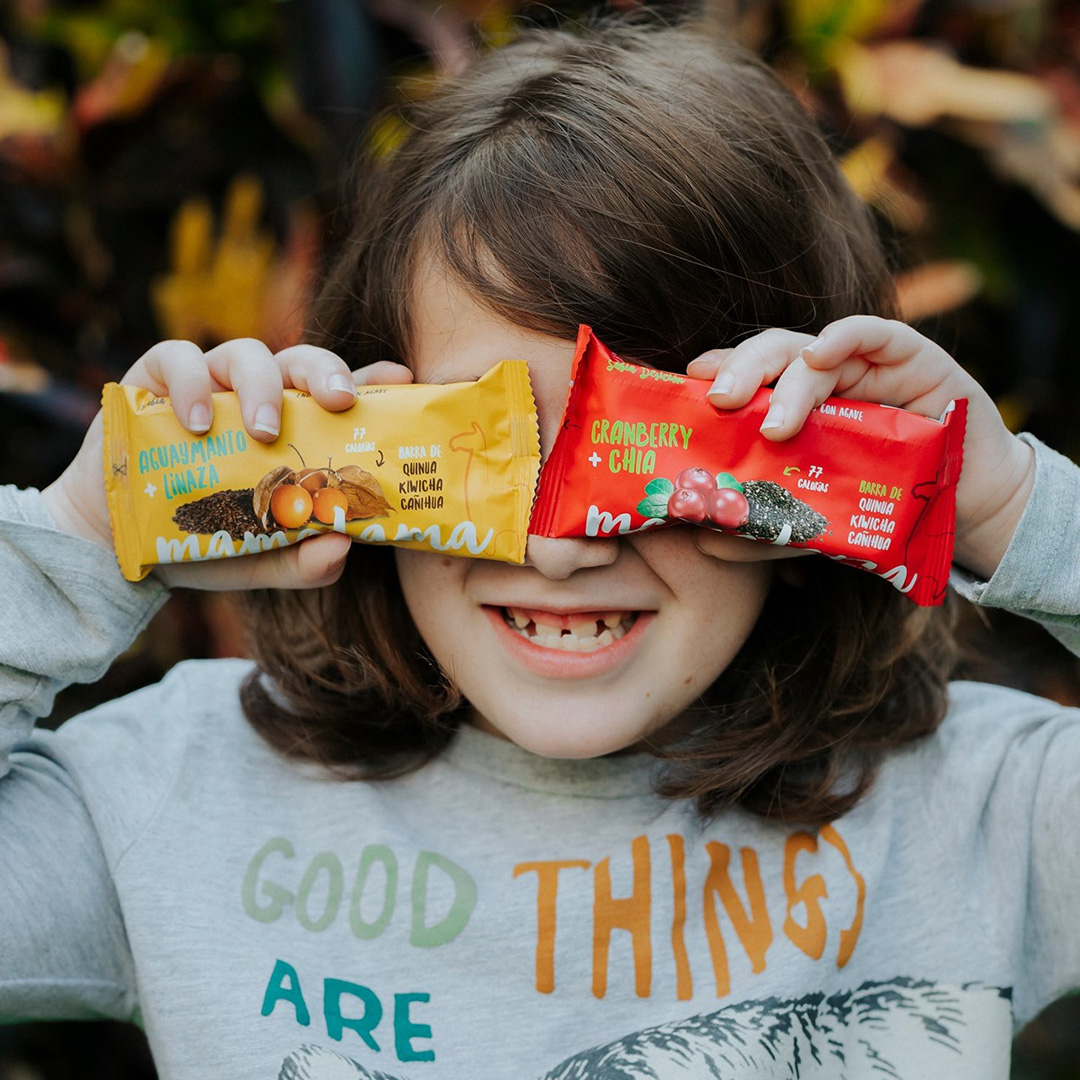
Mamalama believes that healthy eating should also be delicious. Our task was to transfer that and its inspiration in traditional Peruvian ingredients to a packaging that helped the brand to become a benchmark for other healthy snacks.
Usually, thinking about healthy food is not the same as thinking about tasty food. When a product combines both concepts, everyone wants to try it. In our case, we wanted to work with it. This is how we began our relationship with Mamalama, which won a food innovation contest in 2018.
Mamalama came to our studio with one goal in mind: to become the main benchmark for healthy snacks in the country with an offer based on natural ingredients as well as Andean superfoods. Our purpose was to raise the cosmopolitan side of the category -tasty & healthy- but in dialogue with the traditional knowledge of the Peruvian Andes.
Through a typography that simulates freehand writing, we communicated the organic side of the brand; the images of the ingredients refer to the Andean world; and the contrasting use of bright colors seeks to attract the attention of potential consumers. The sum of these elements projects a snack that is natural, healthy and innovative, but above all, Peruvian and original.
