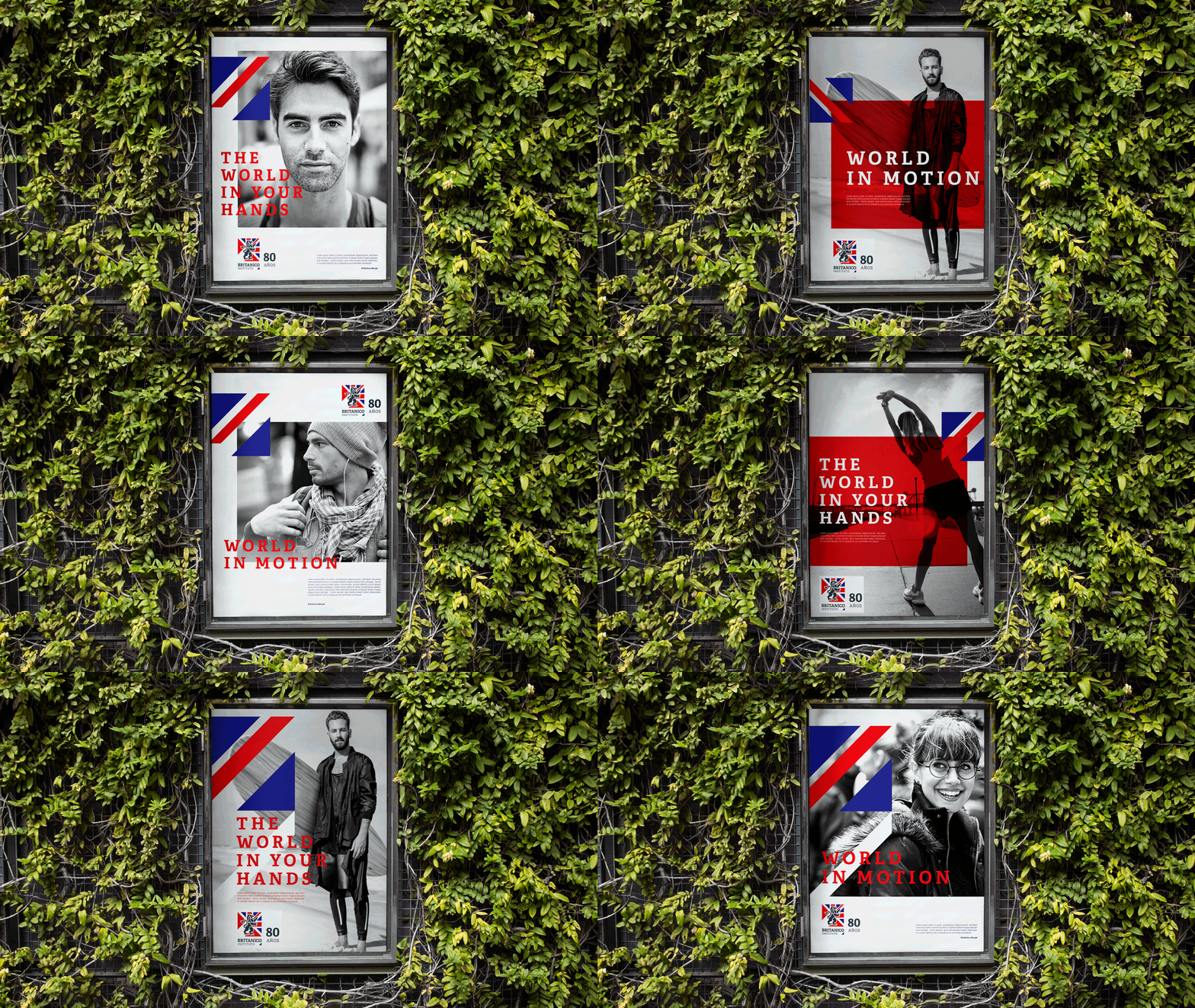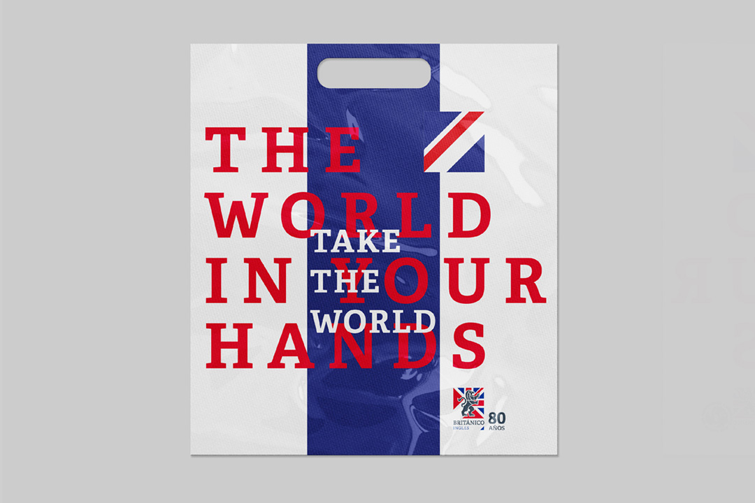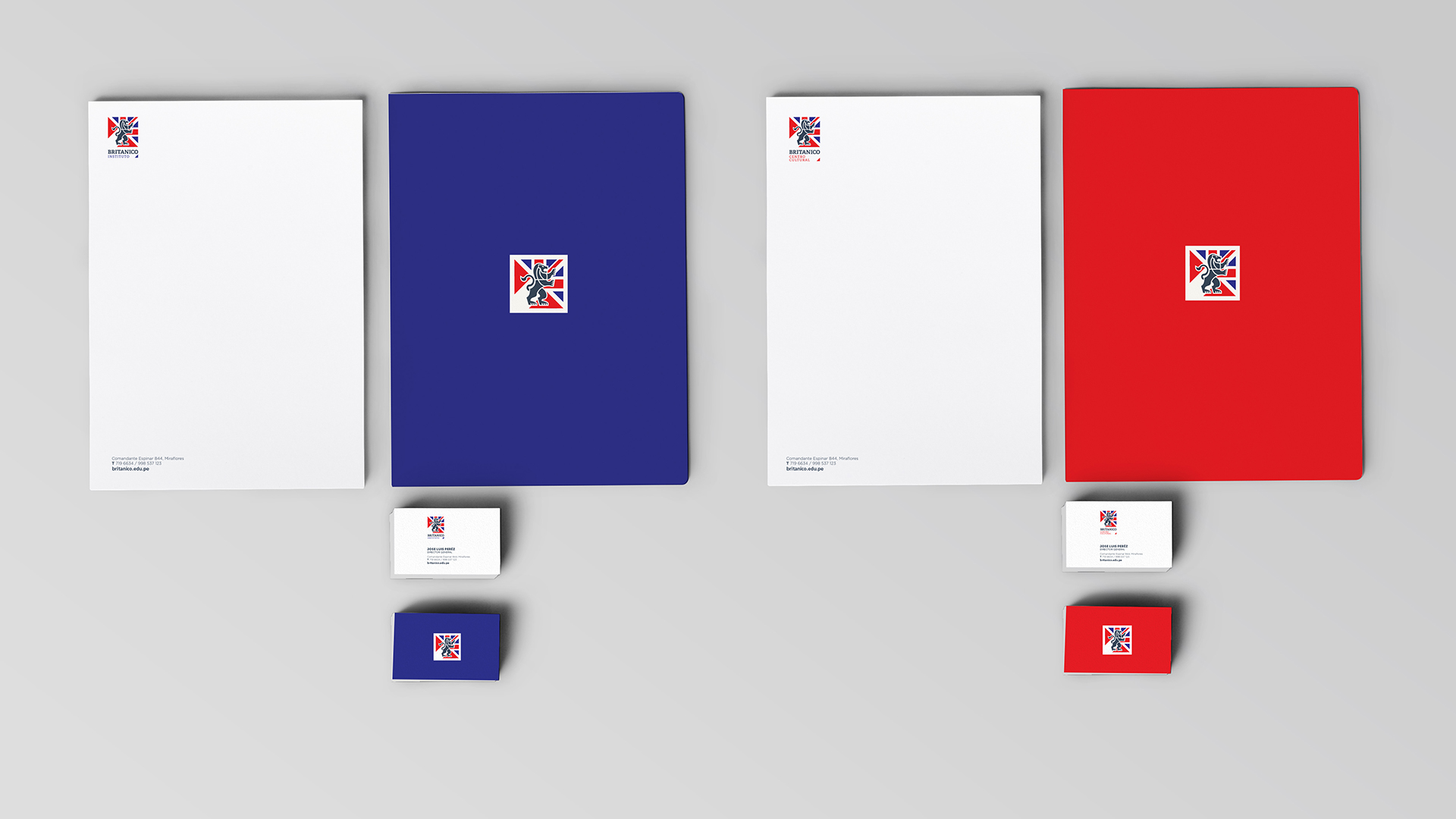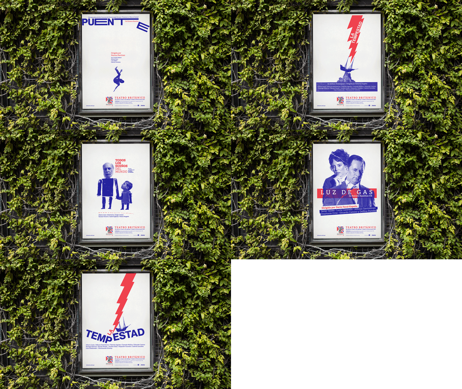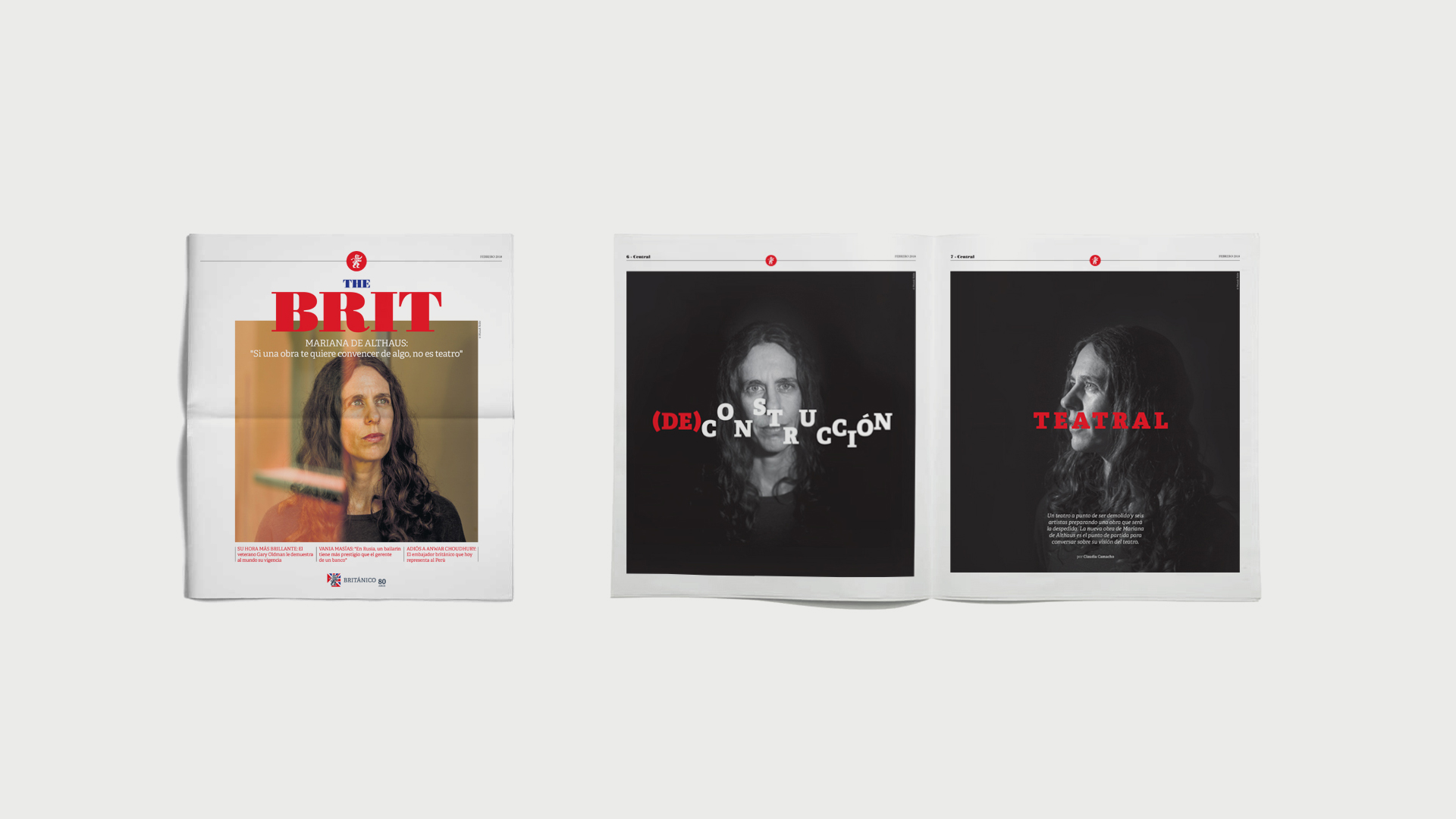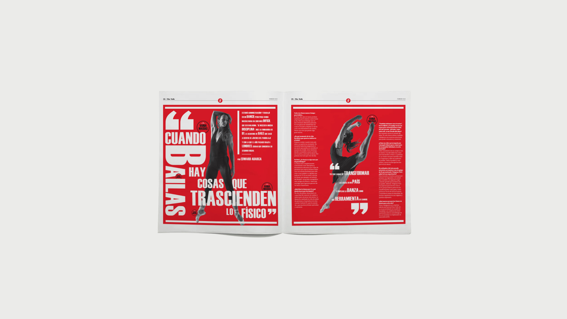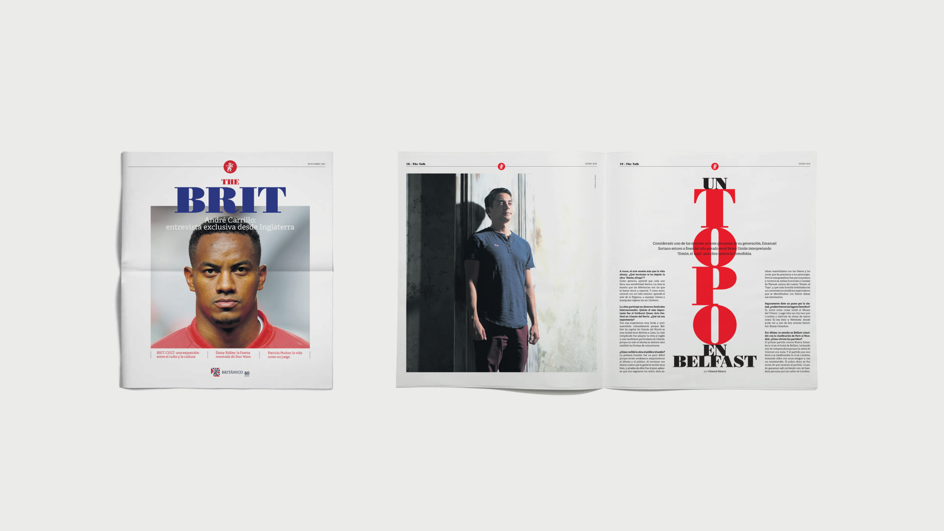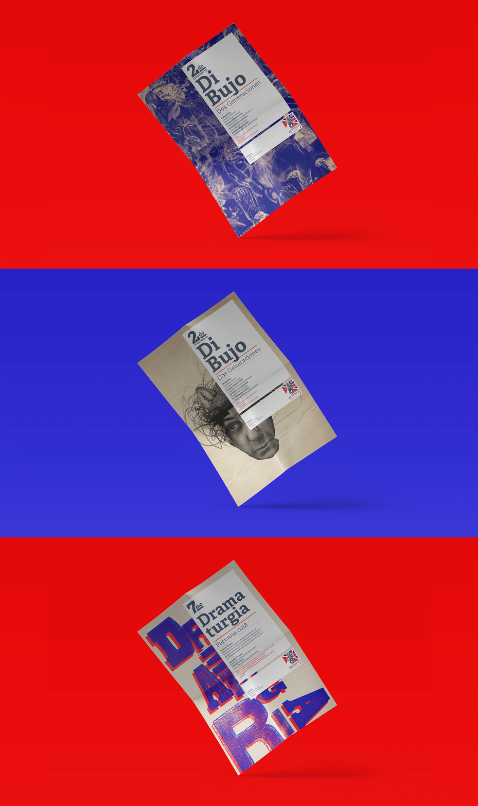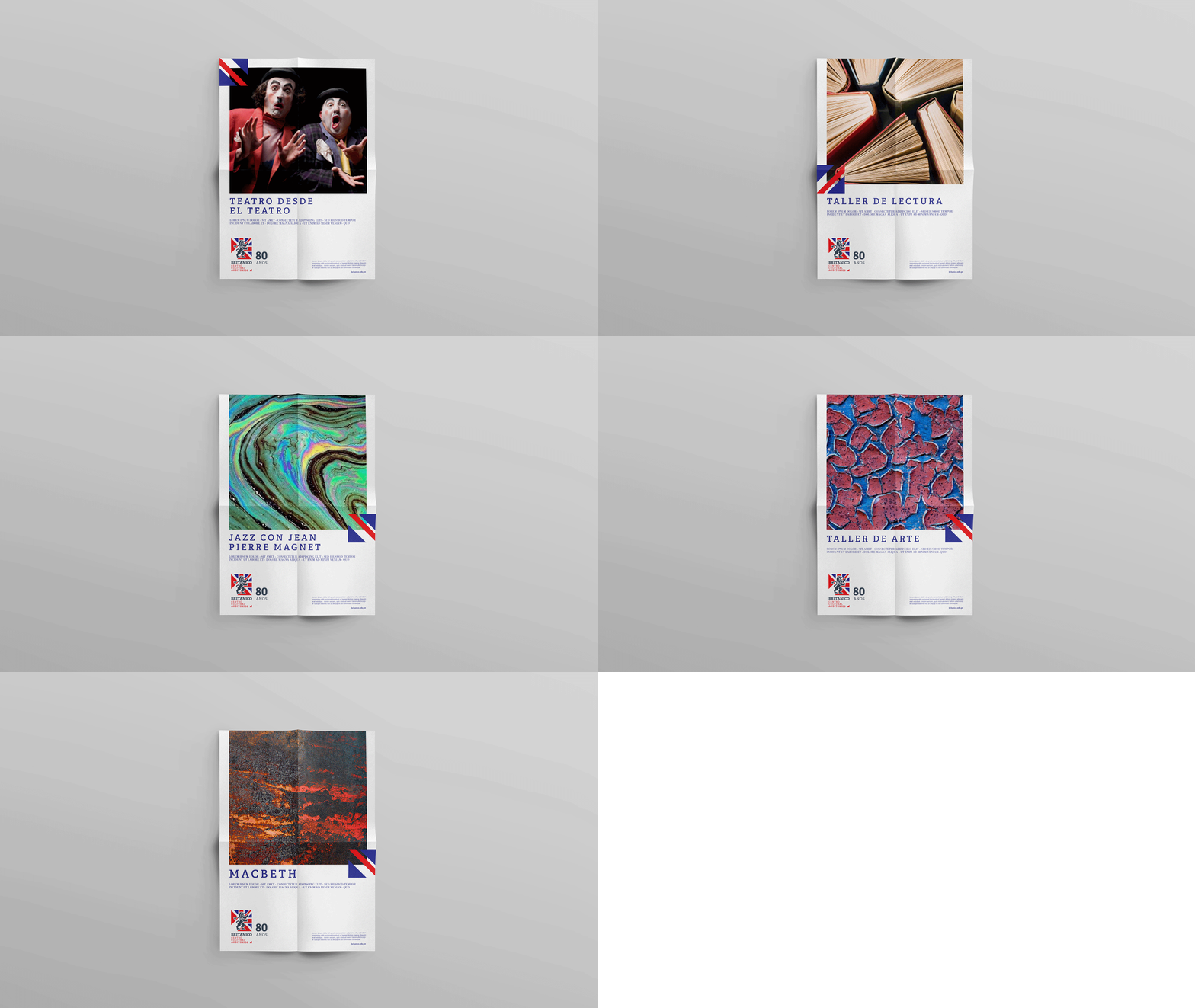
Since 1937, the British Peruvian Cultural Association (El Britanico) has held the mission of spreading British culture and language. On its 80th anniversary we were entrusted with the challenge of making its visual identity closer to younger people and organizing its graphic communications system.
“El Britanico” has always been a bridge between British and Peruvian culture. But, as it turned 80, it was obvious it needed to be much more: a bridge between past and present, between a traditional institution and a modern audience That was the task we received: to reinvigorate its visual identity.
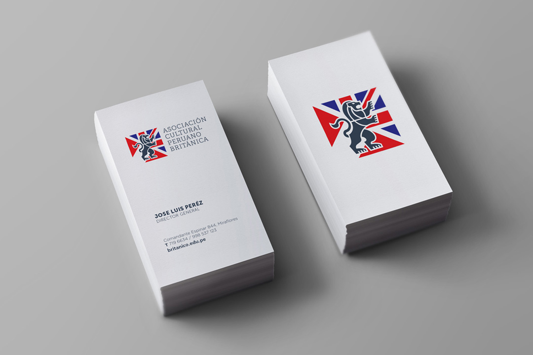
At the same time, this mission also had to fulfill another objective: to homogenize the visual identity of all its spaces. The institution is commonly known as a language school, but it also has a theatre, library, art galleries and publications that encourage the exchange between Peru and the United Kingdom. However, the structure of its brand was confusing, and many people did not see them as part of the same organization.
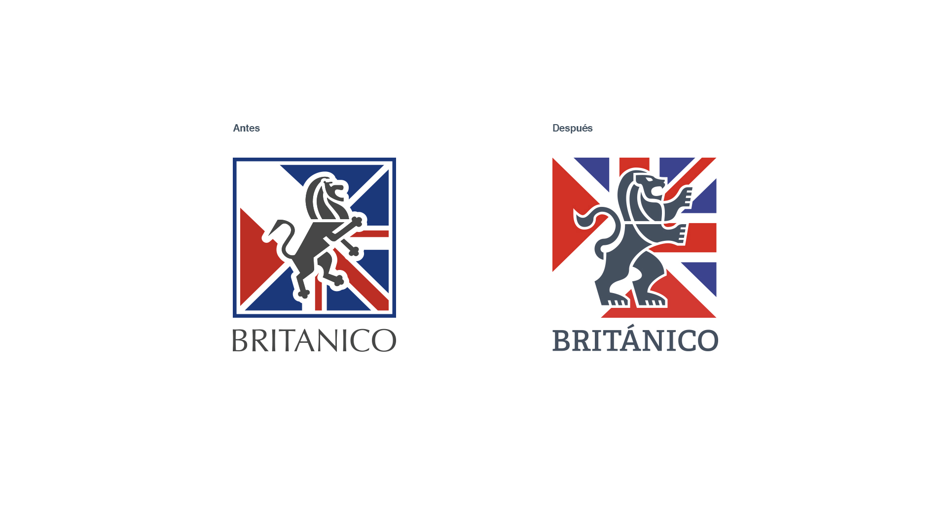
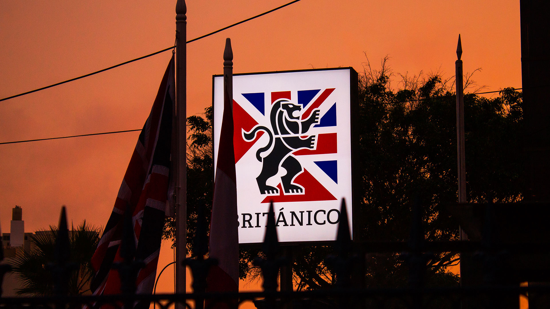
To accomplish all of this, we evoke the British spirit through a universally recognizable symbol: we used the classic lion standing on two legs as an icon of strength and leadership, but giving it a graphic refresh, and the coincidence of the colors between the Union Jack and Peruvian flag made it possible to represent the alliance between both countries. With this, we managed to show “El Britanico” as a brand that leads cultural exchange with the British world.
